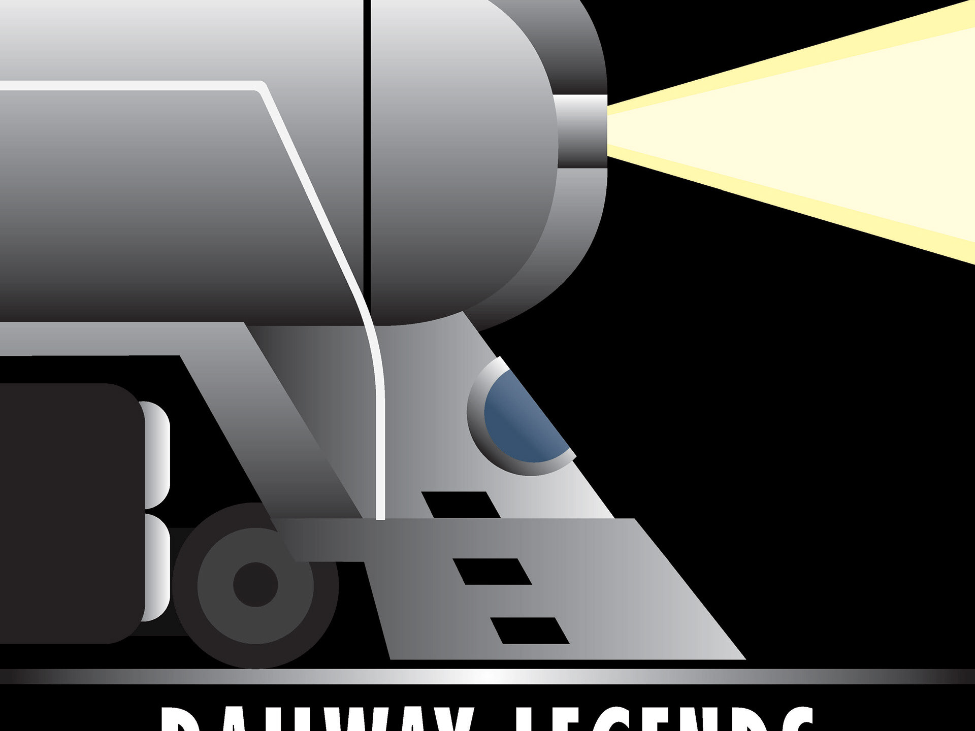
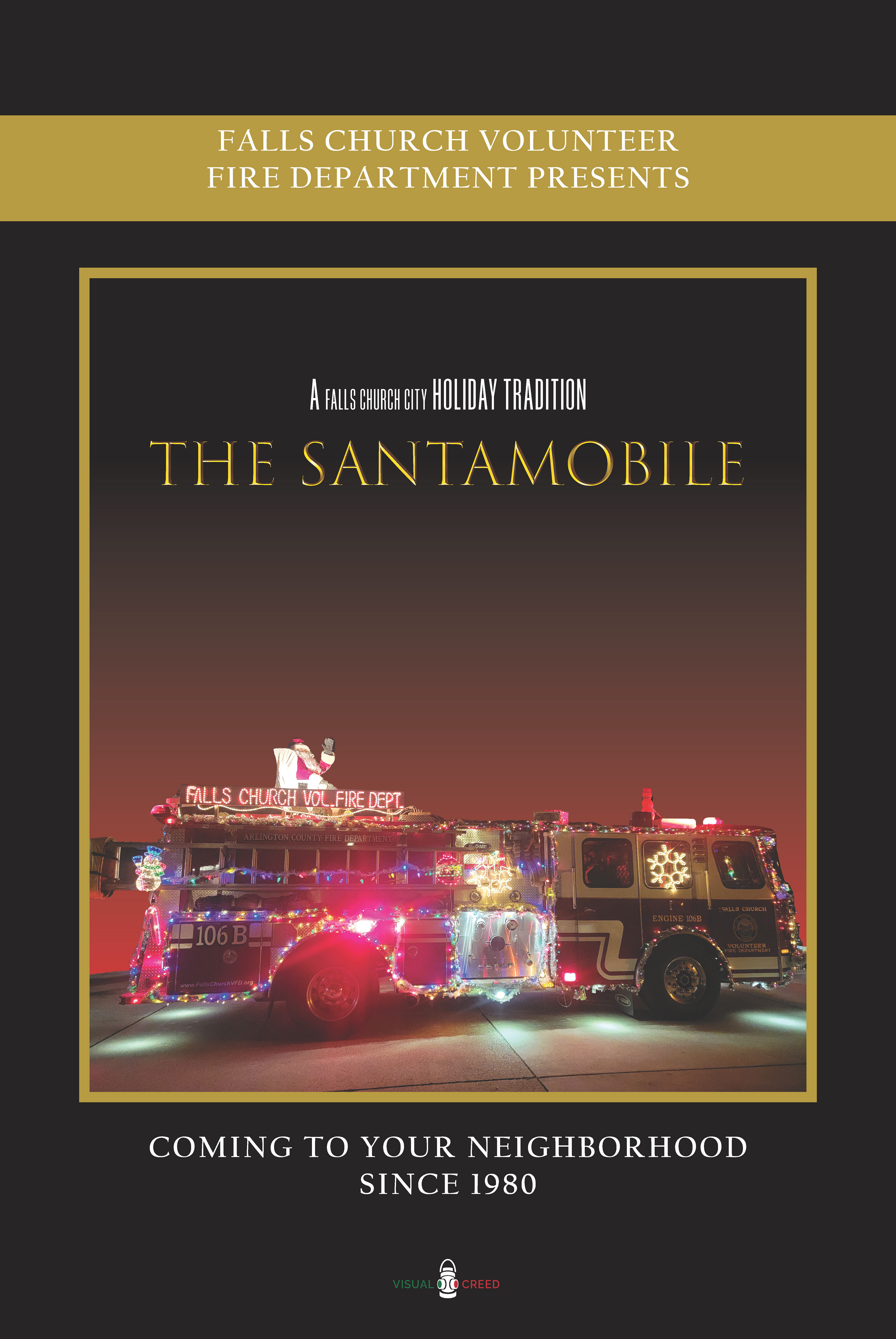
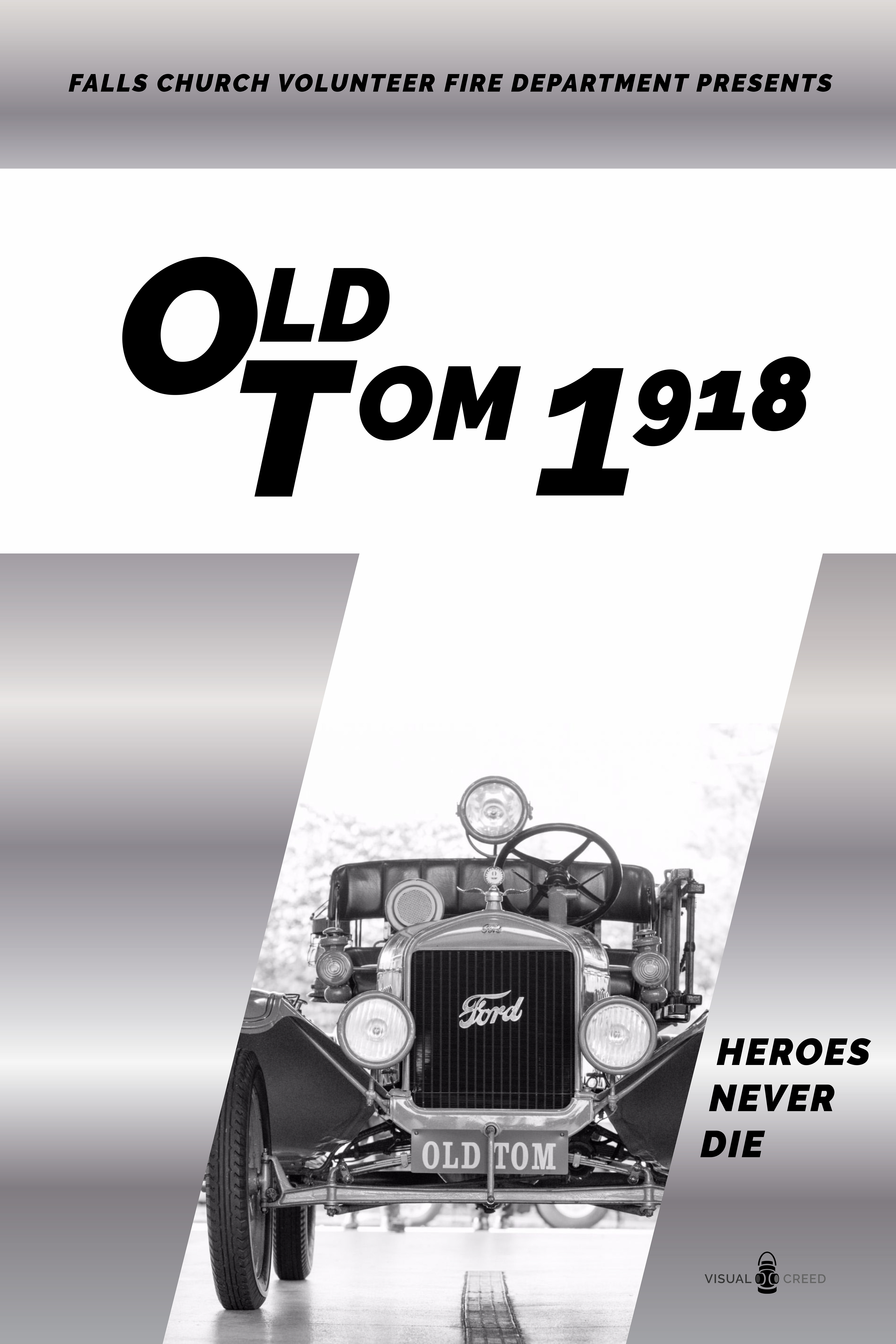
Falls Church Volunteer Fire Department Posters (Spring 2024)
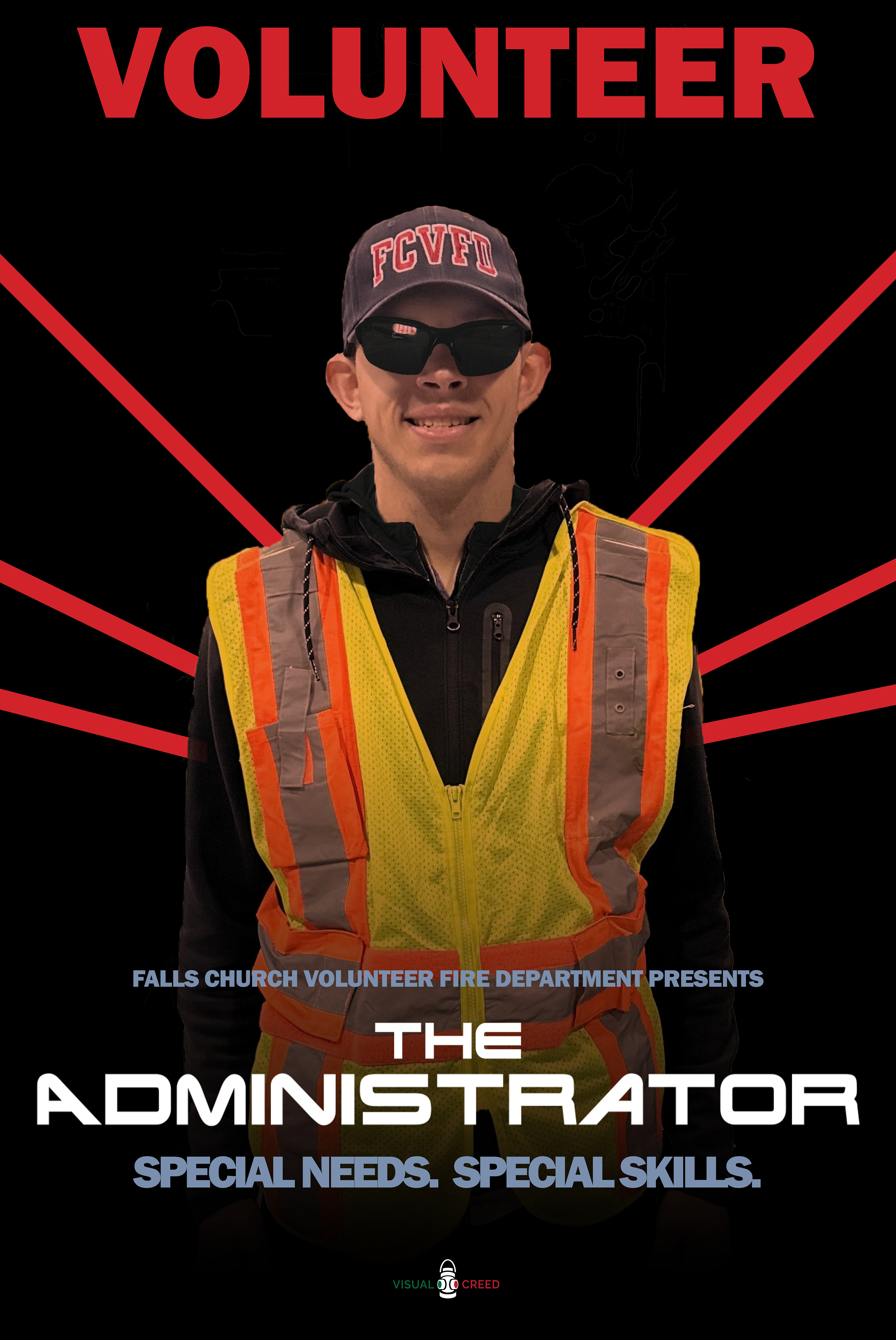
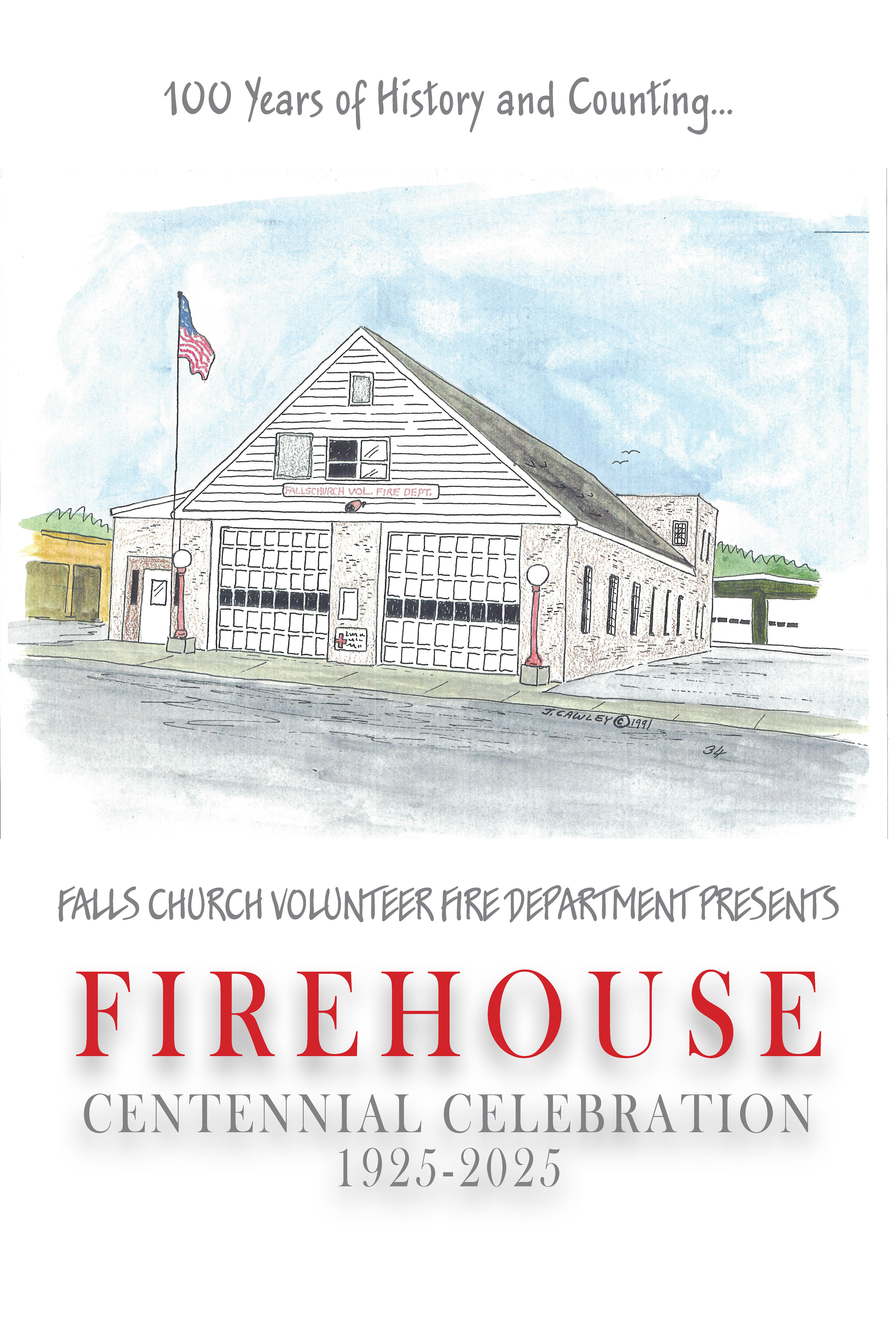
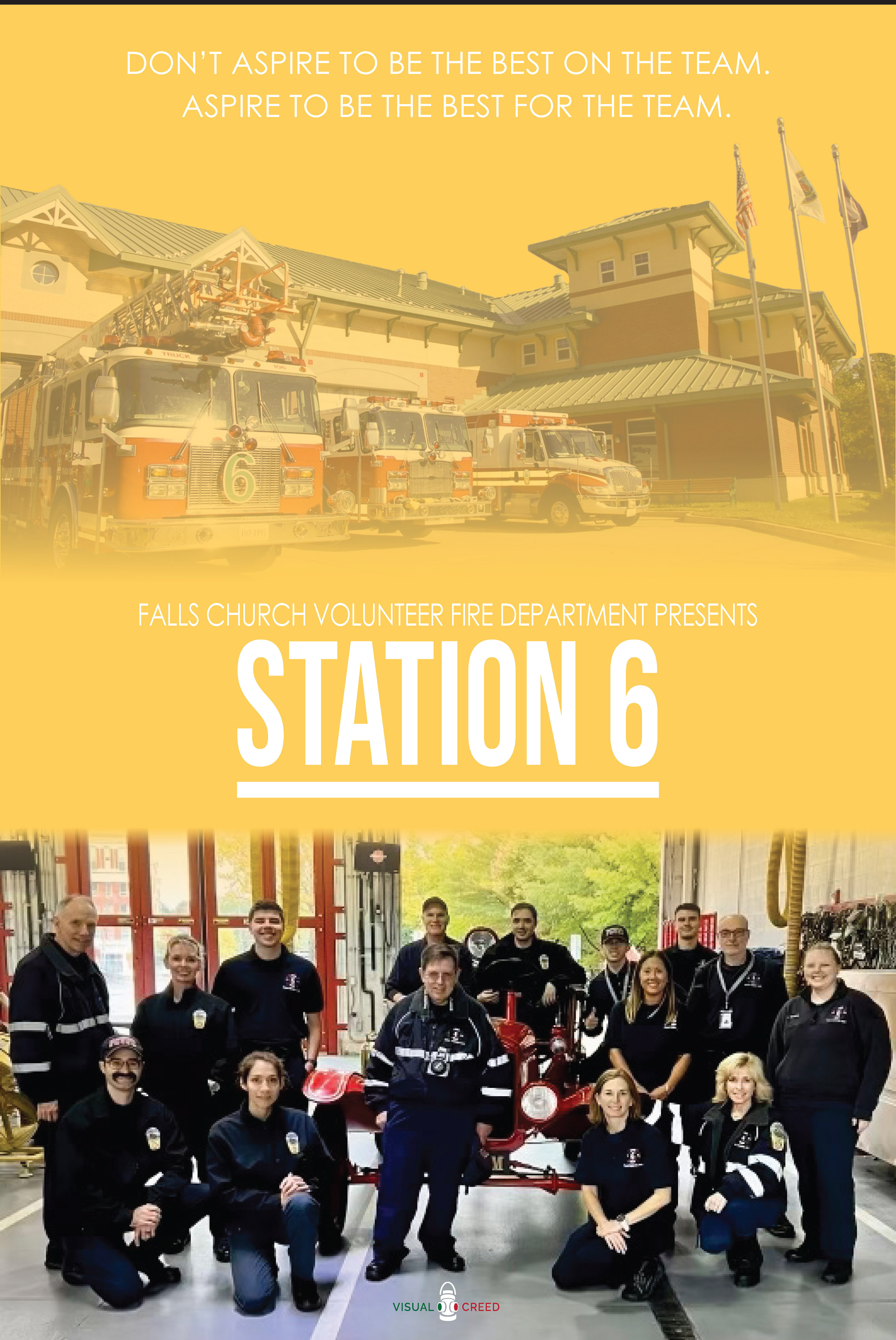
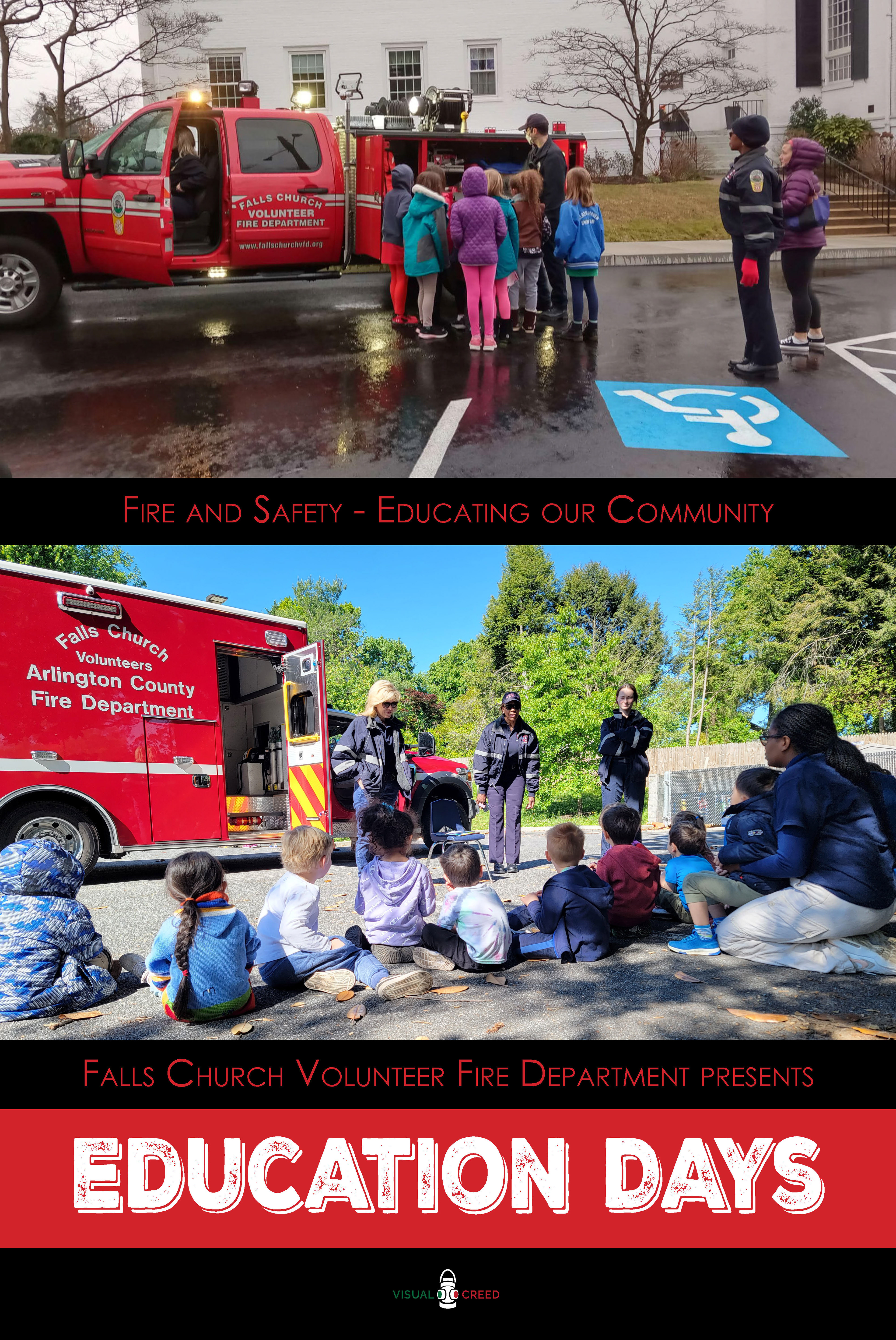
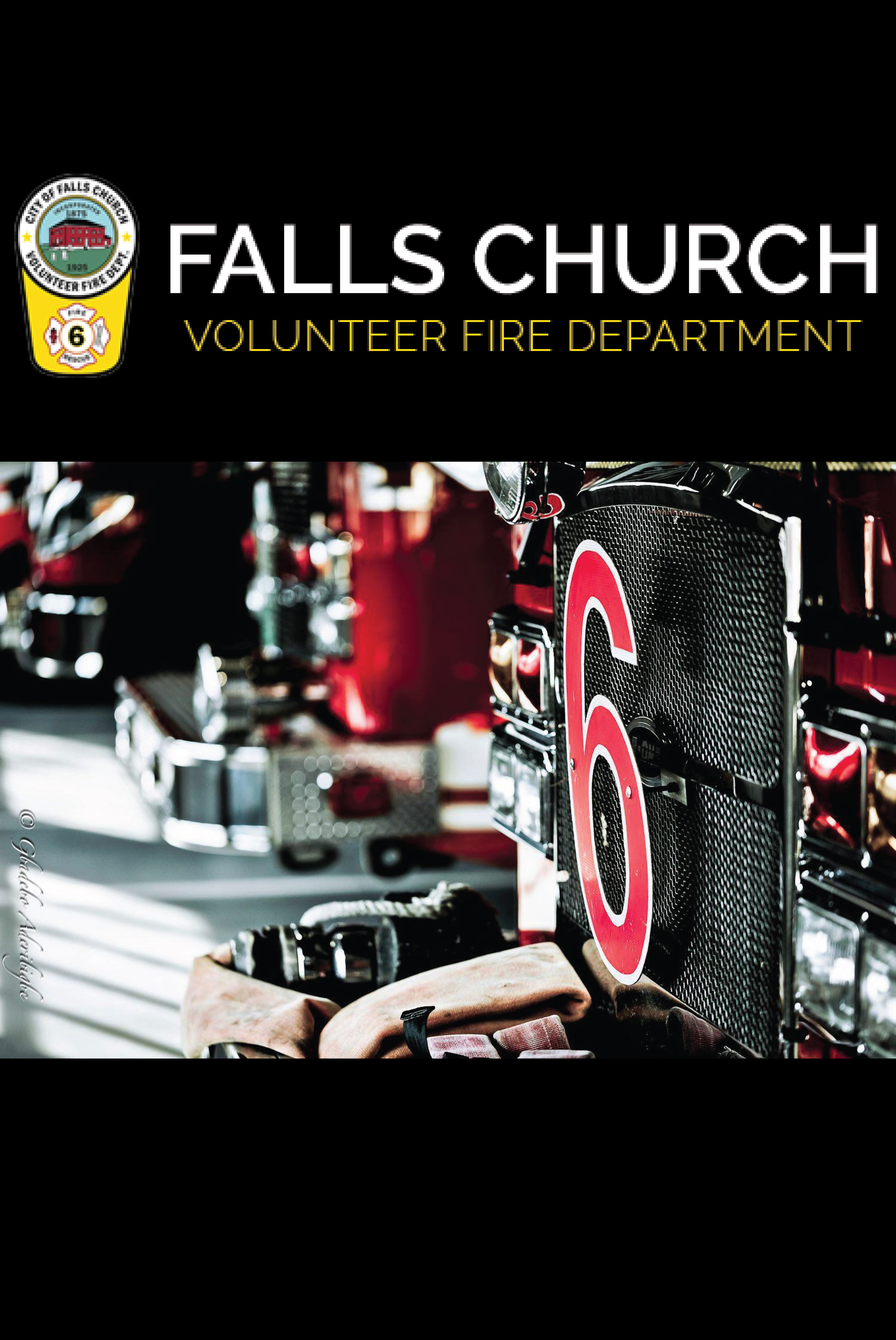
In 2024, I got the opportunity to design posters for the Falls Church Volunteer Fire Department in Falls Church, VA. Each of these posters, designed to look like professional movie posters, are meant to tie-in to the fire department's history and various activities that they host for the city. These posters are currently on display in the firehouse's official conference room where they host meetings and events (i.e. children's birthday parties). Each poster is 24 x 36 Inches in size.
Poster #1
Poster #2
Poster #3
Poster #4
Poster #5
Poster #6
Poster #7
The One That Got Away (Fall 2023)
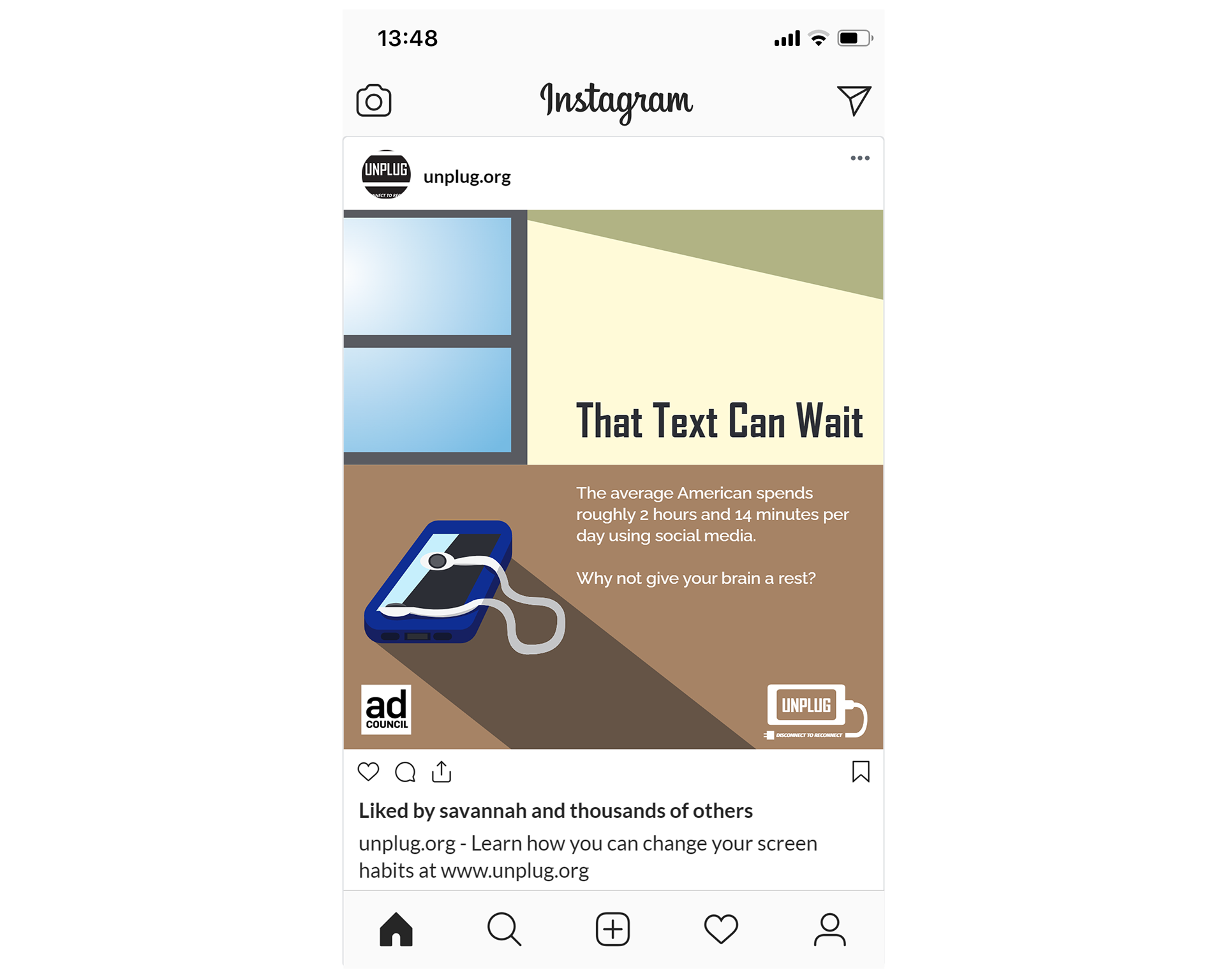
As part of my Professional Design Practices class at George Mason University (Fall 2023), we were tasked with taking an existing design project we had completed for a different class and reworking it for our professional portfolio. For my project, I decided to rework a PSA Campaign project I had done for my Advertising Design class (Spring 2023). The PSA I created delt with the effects that excessive screentime and technology usage can have on people. From a design perspective, I felt the materials I made for this campaign did not do the campaign's message justice and were overall difficult to read, hence the redesign. Both overall campaign projects consist of an original PSA logo designed for the campaign, a print ad, a website homepage mockup, 3 social media ads, and a guerilla marketing piece (i.e. a sticker/magnet).
PSA Campaign Logo

PSA Campaign Logo (Original)
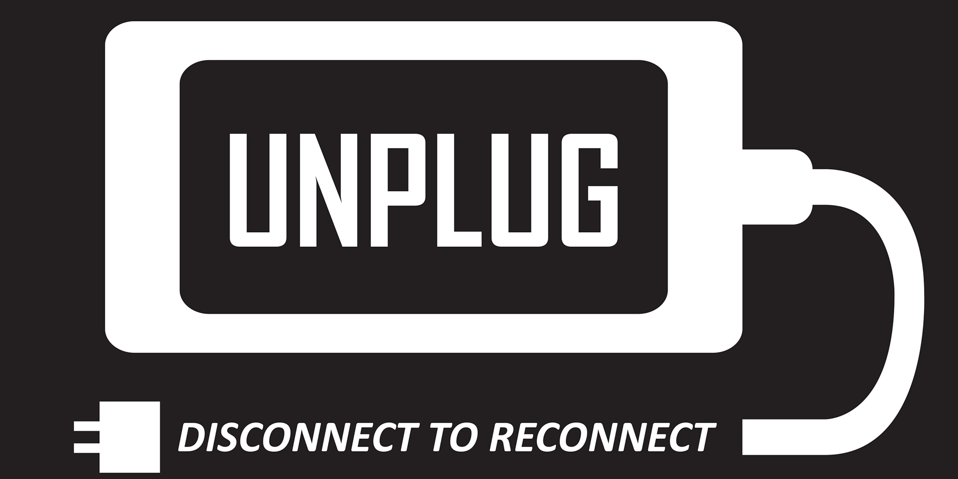
PSA Campaign Logo (Revised)
PSA Print Ad
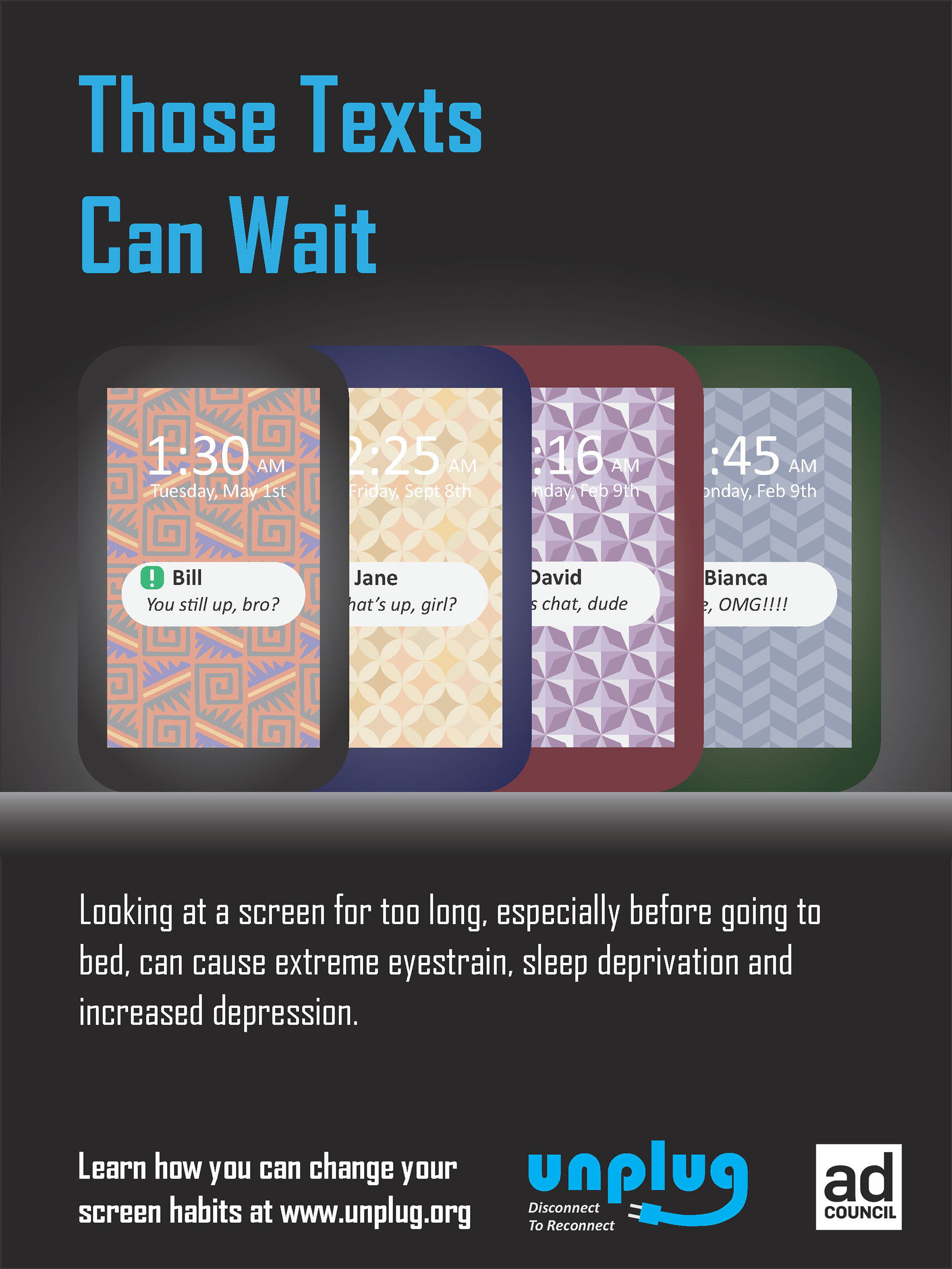
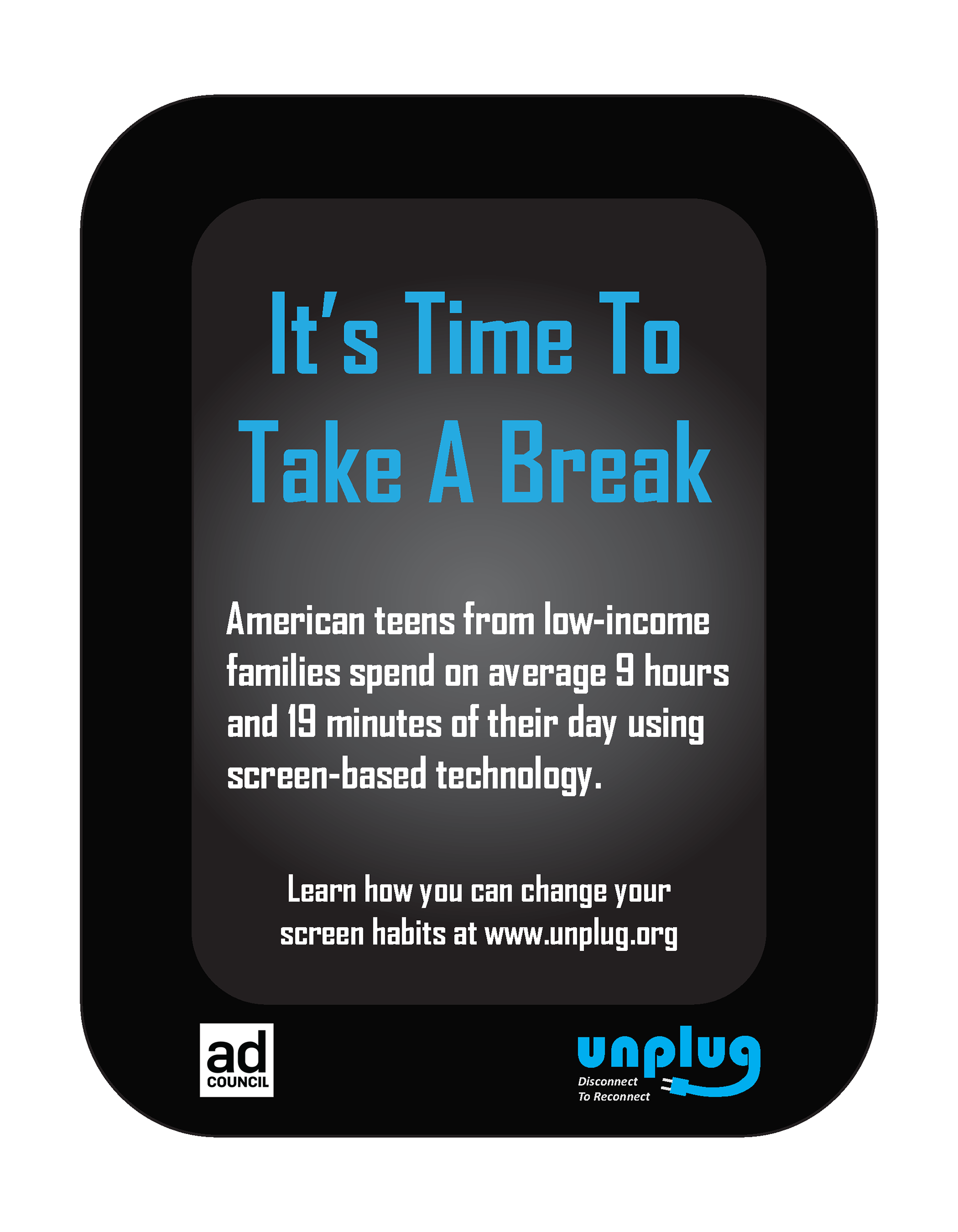
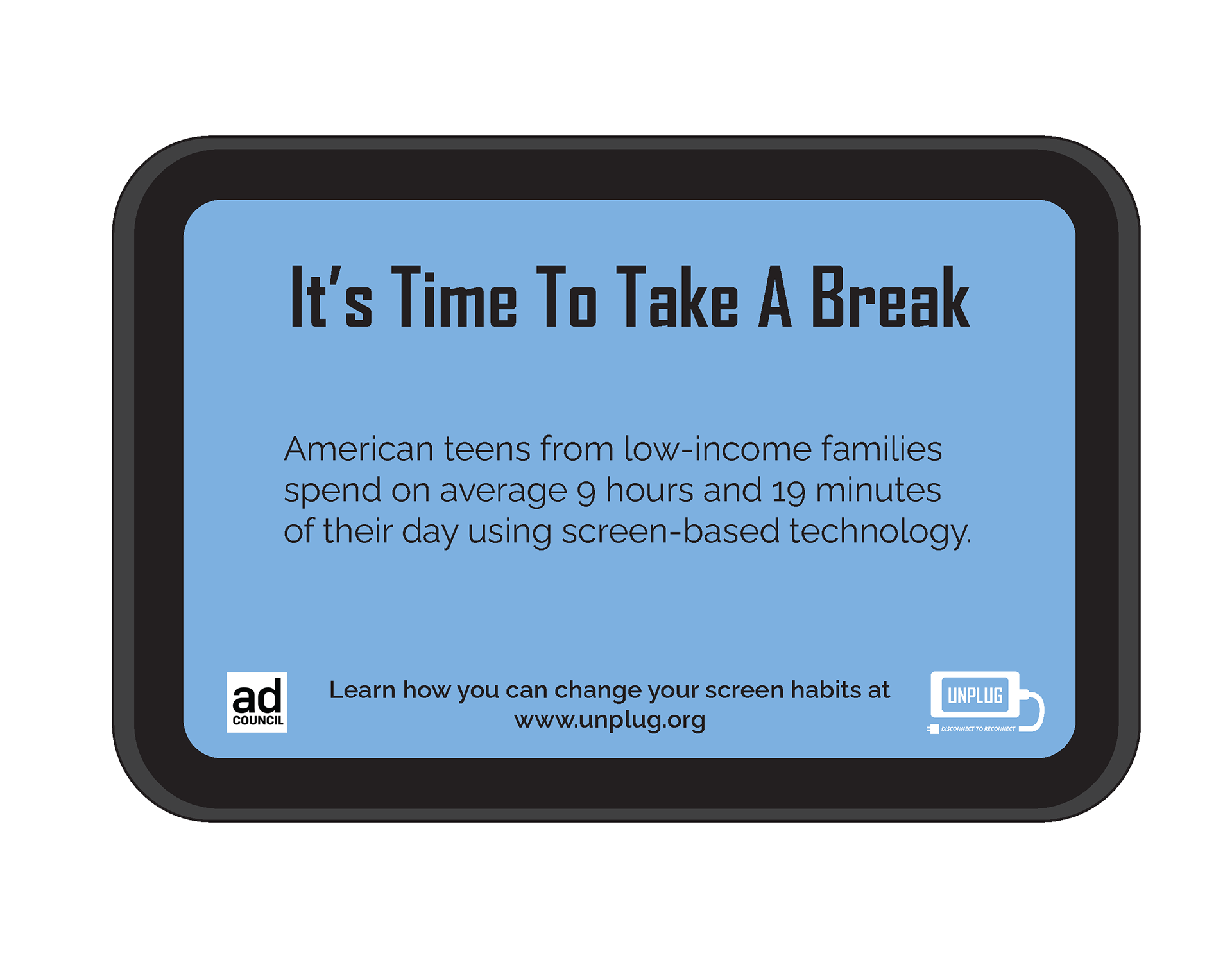
PSA Print Ad (Original)
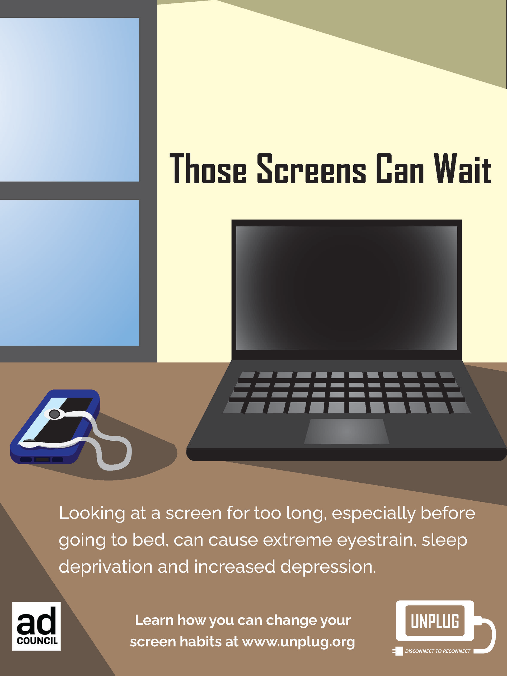
PSA Print Ad (Revised)
PSA Web Landing Page
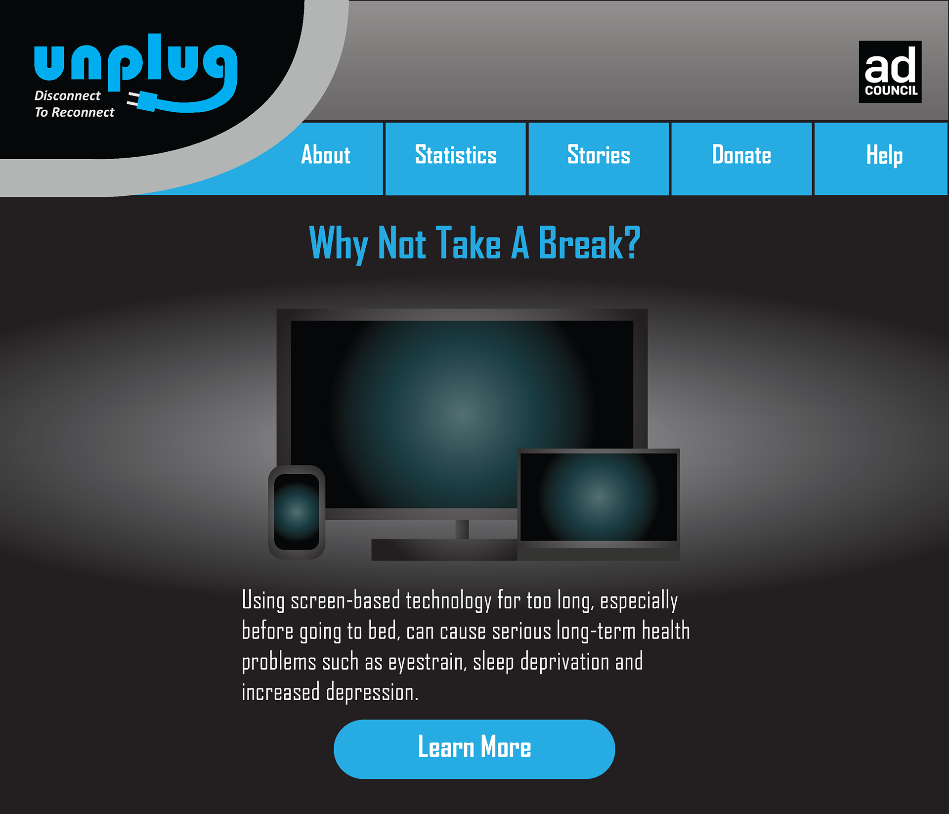
PSA Web Landing Page (Original)
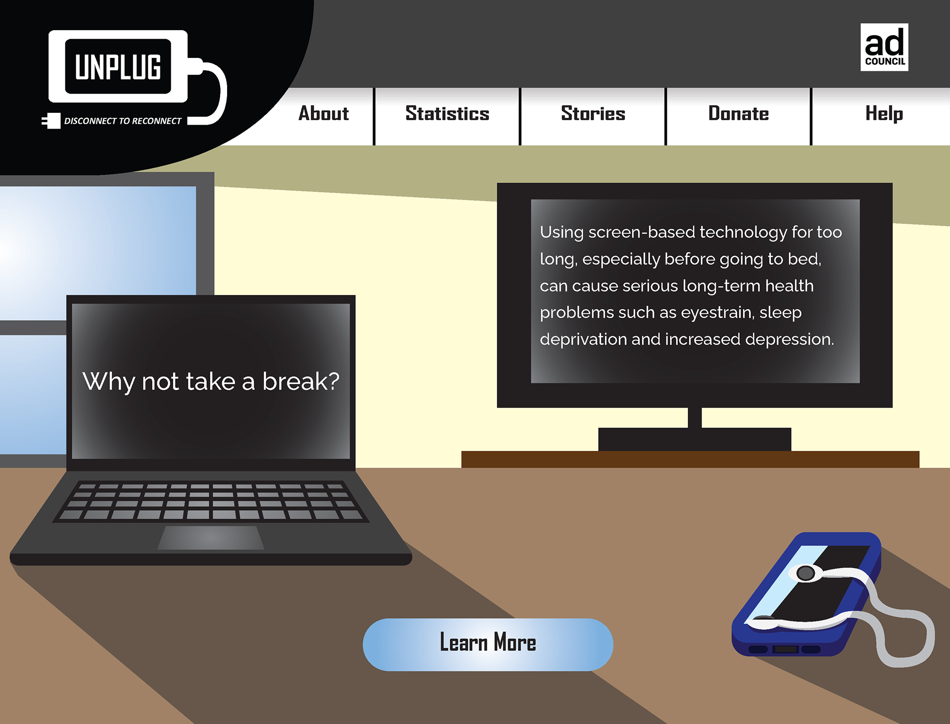
PSA Web Landing Page (Revised)
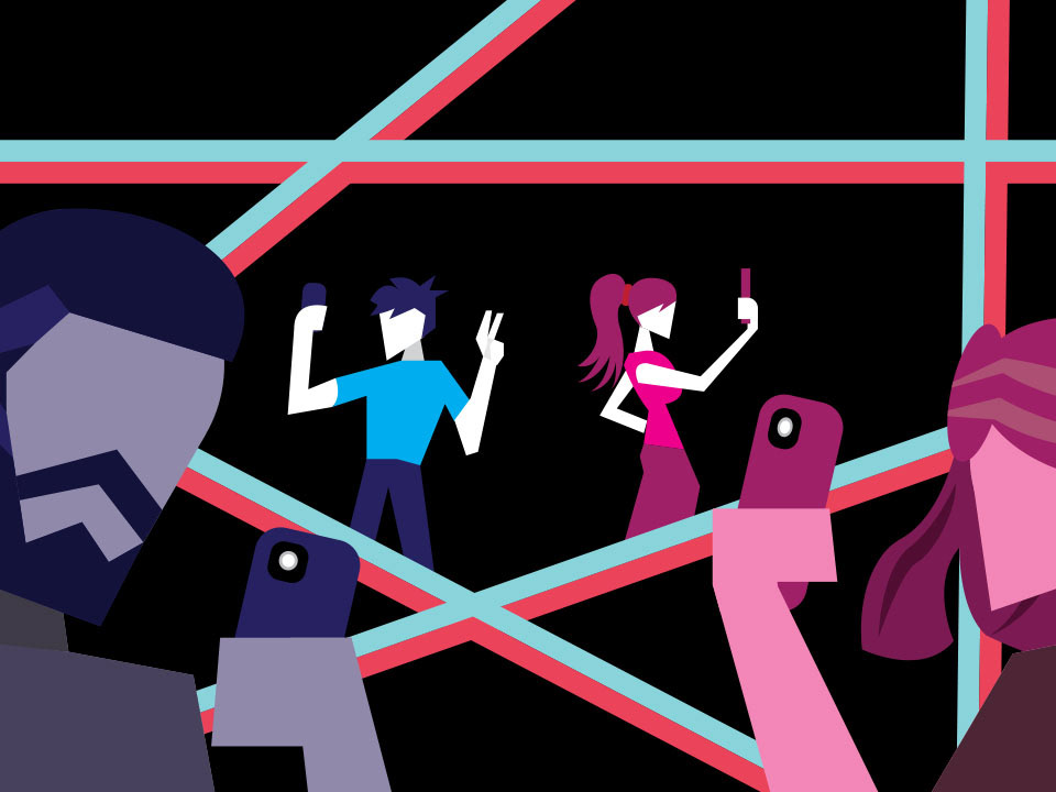
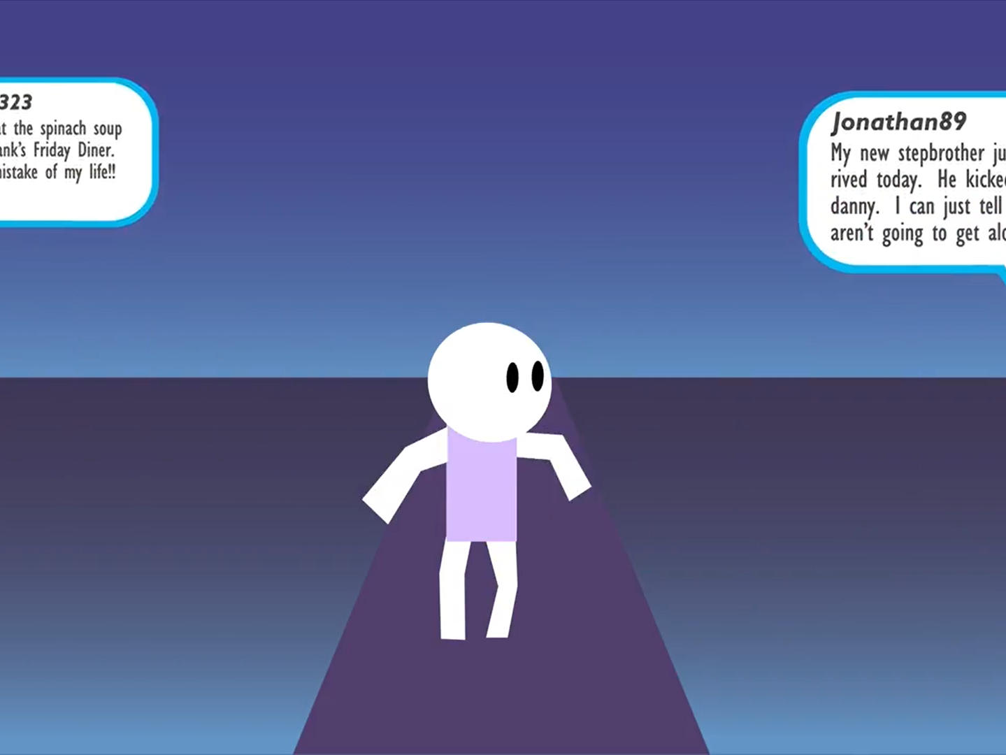
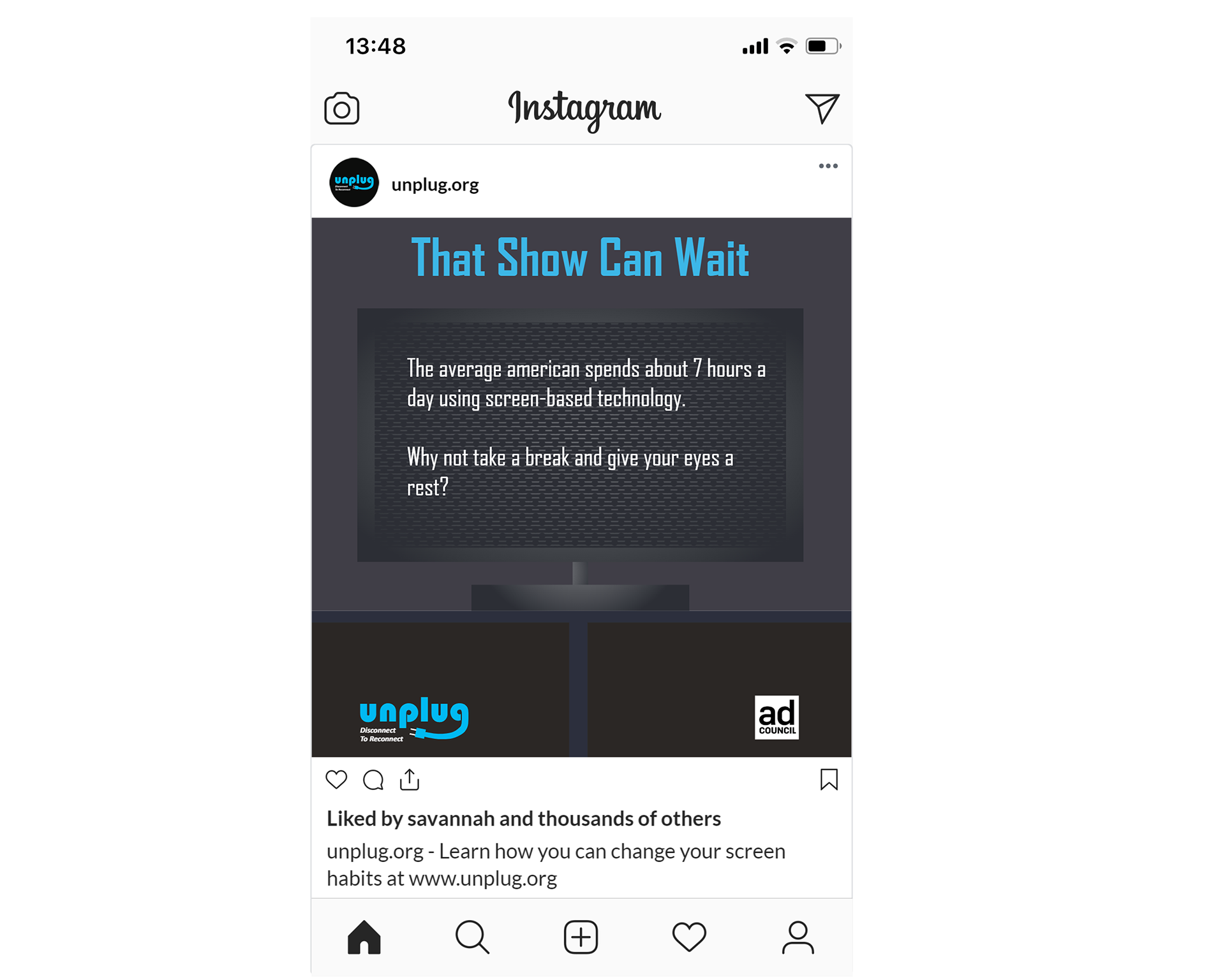
PSA Social Media Ads
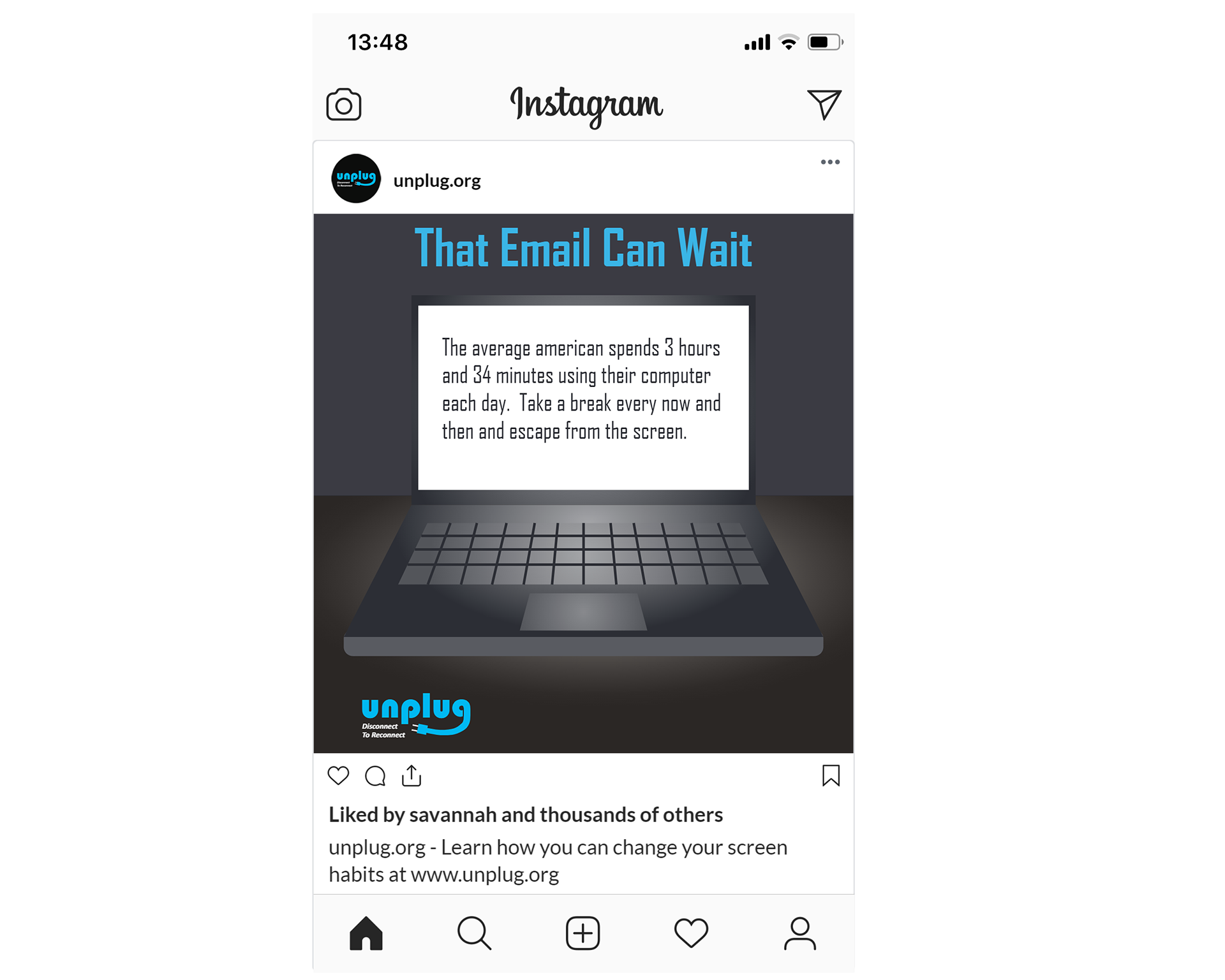
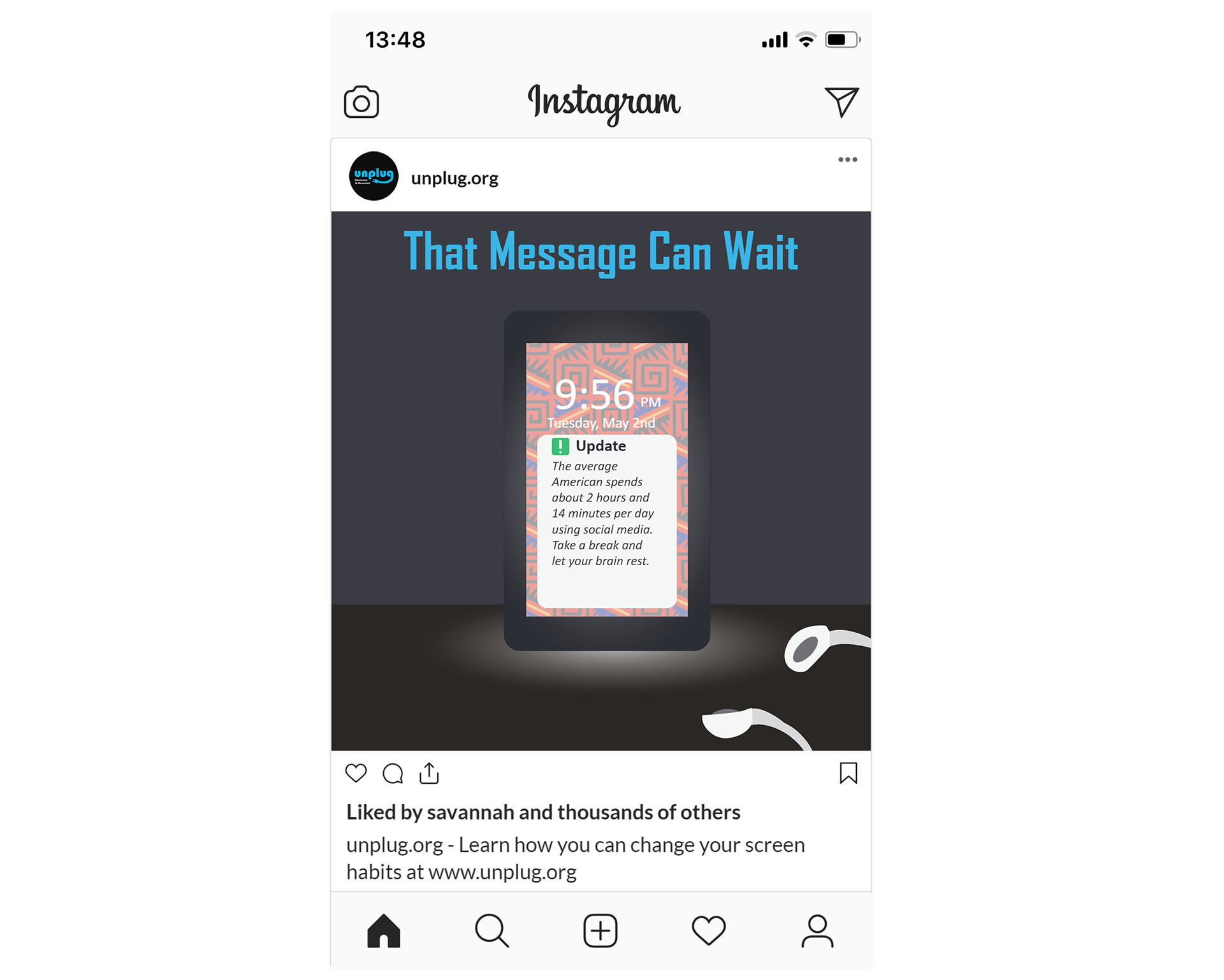
Social Media Ad #1 (Original)
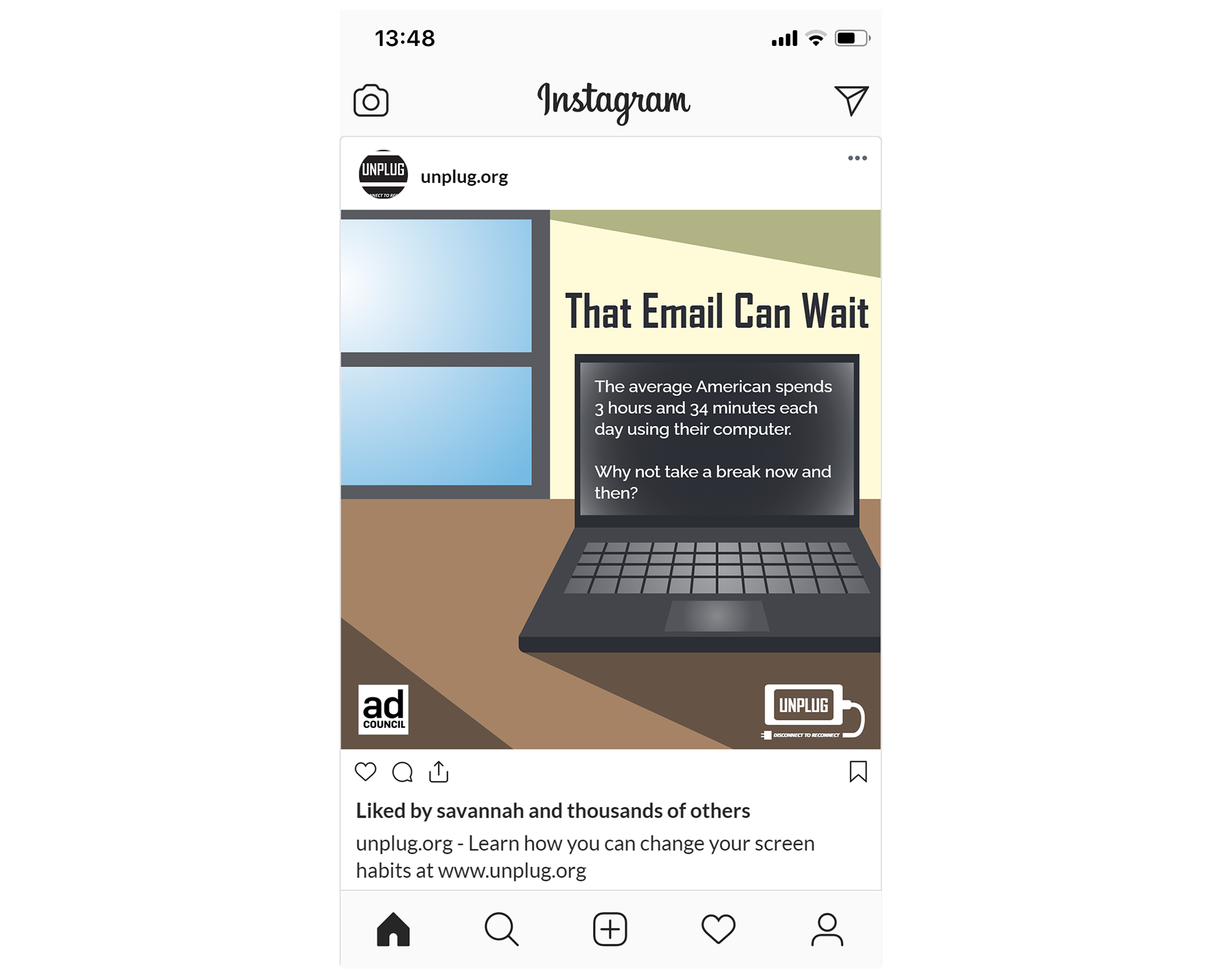
Social Media Ad #2 (Original)
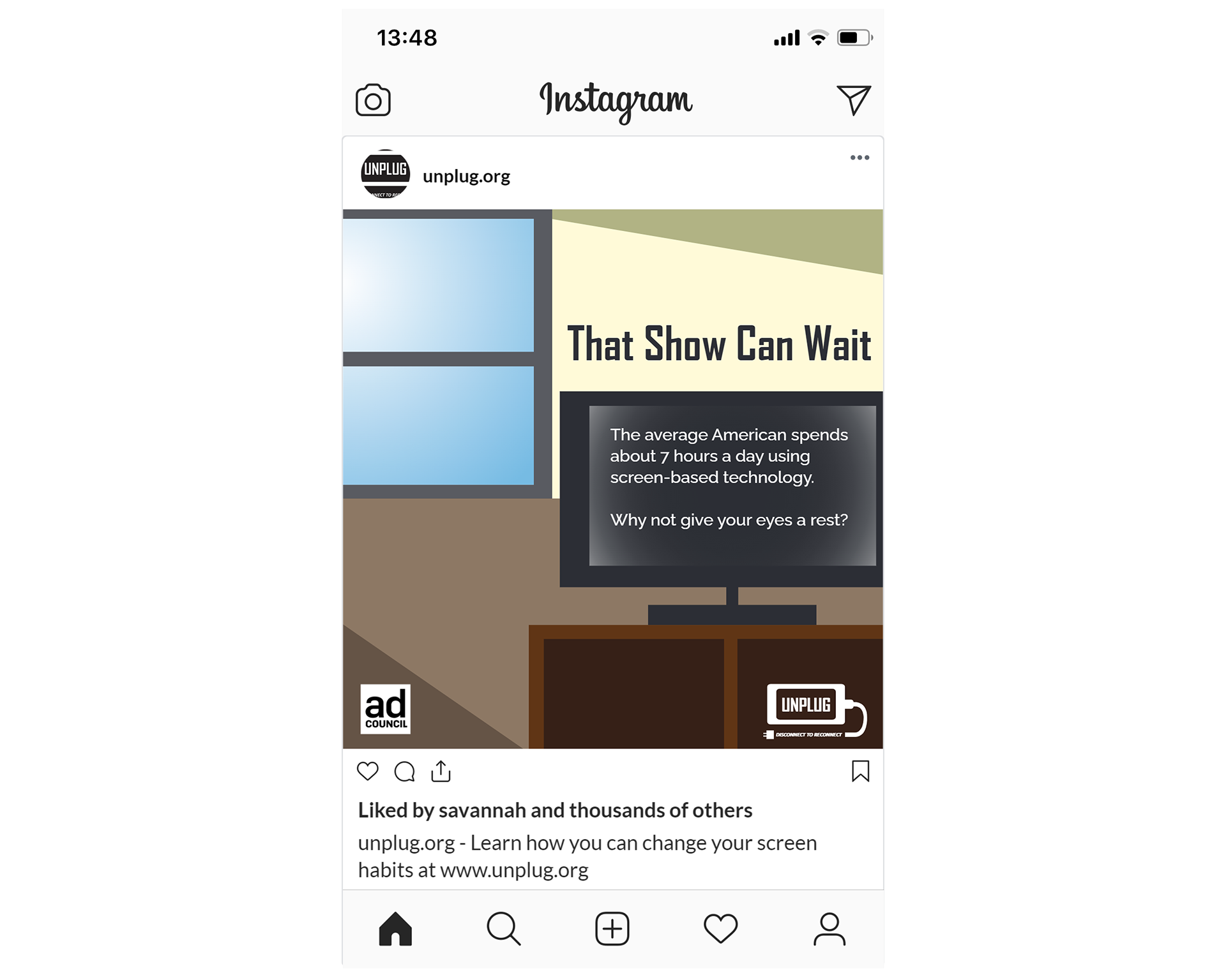
Social Media Ad #3 (Original)
Social Media Ad #1 (Revised)
Social Media Ad #2 (Revised)
Social Media Ad #3 (Revised)
PSA Guerilla Marketing
Guerilla Marketing (Original)
Guerilla Marketing (Revised)
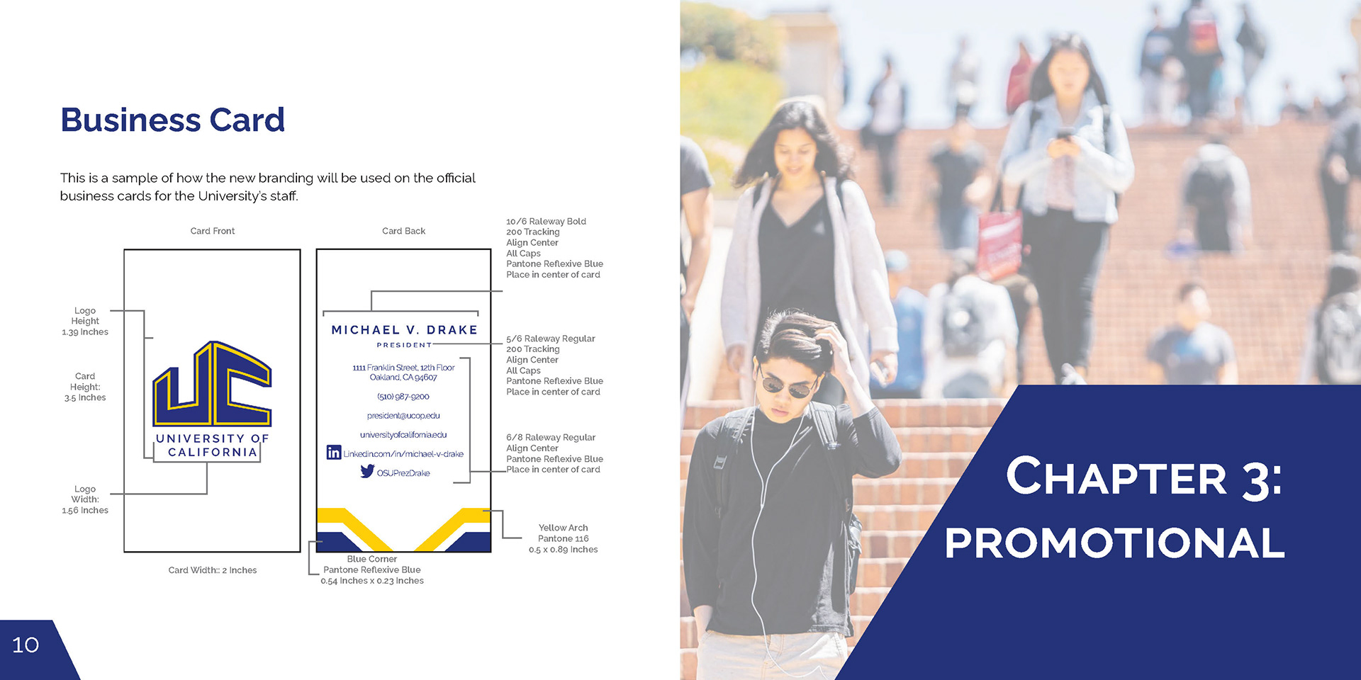
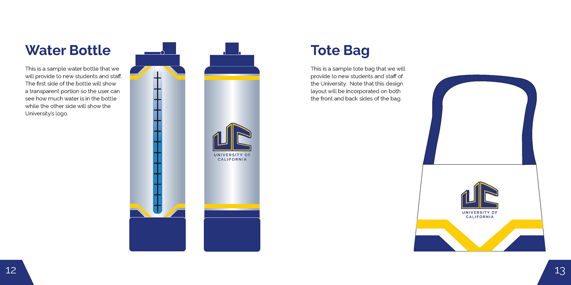
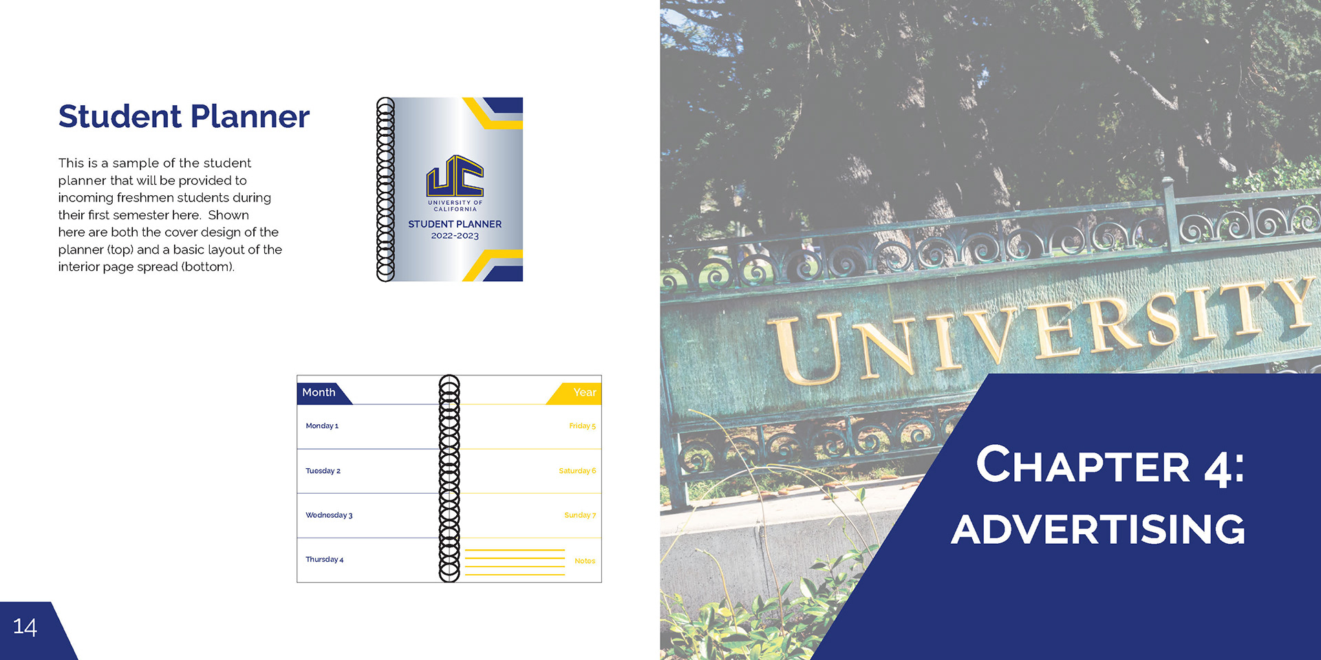
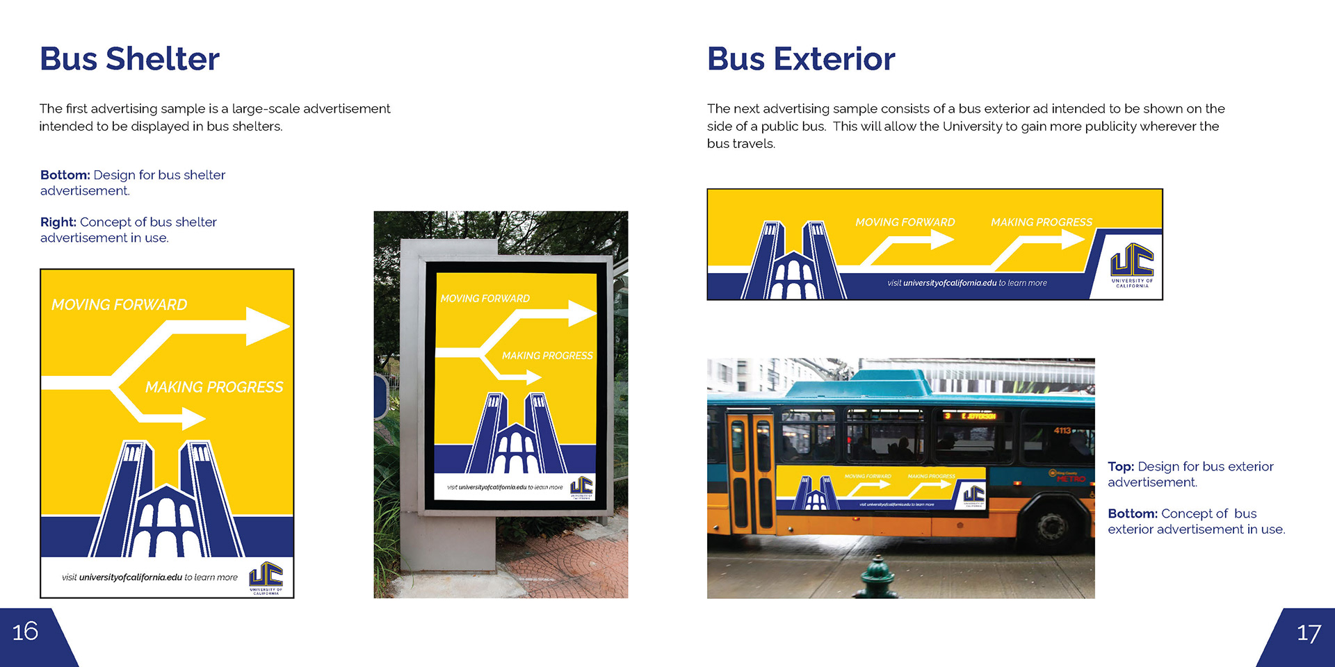
Corporate Branding Identity Guidelines Manual (Fall 2022)
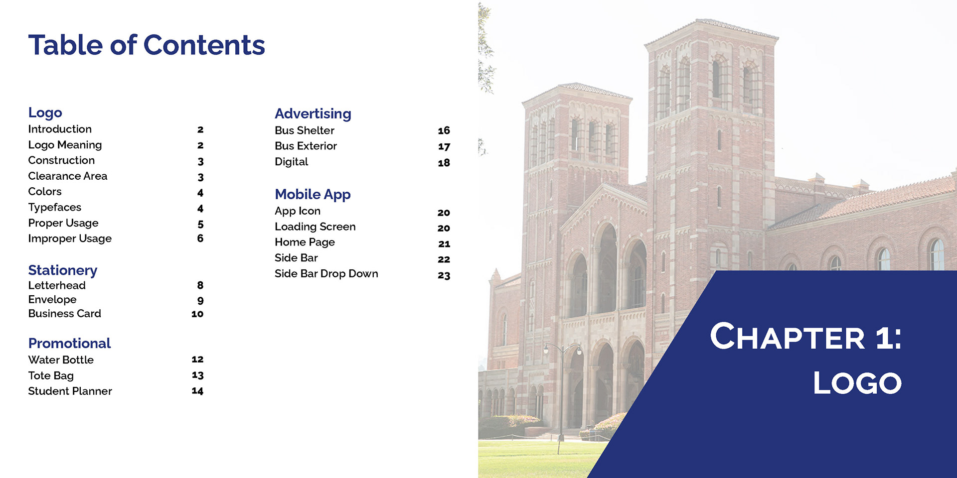
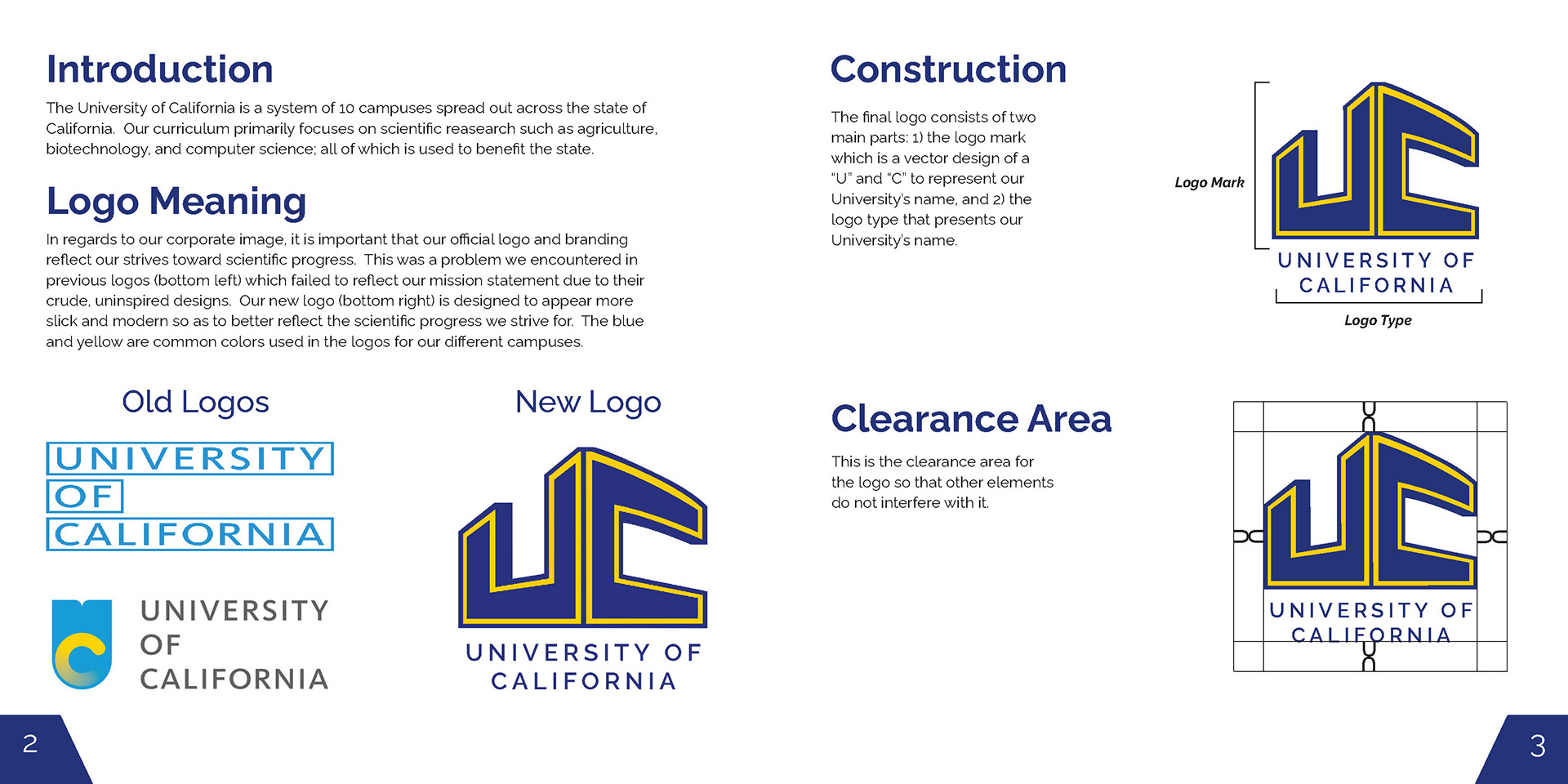
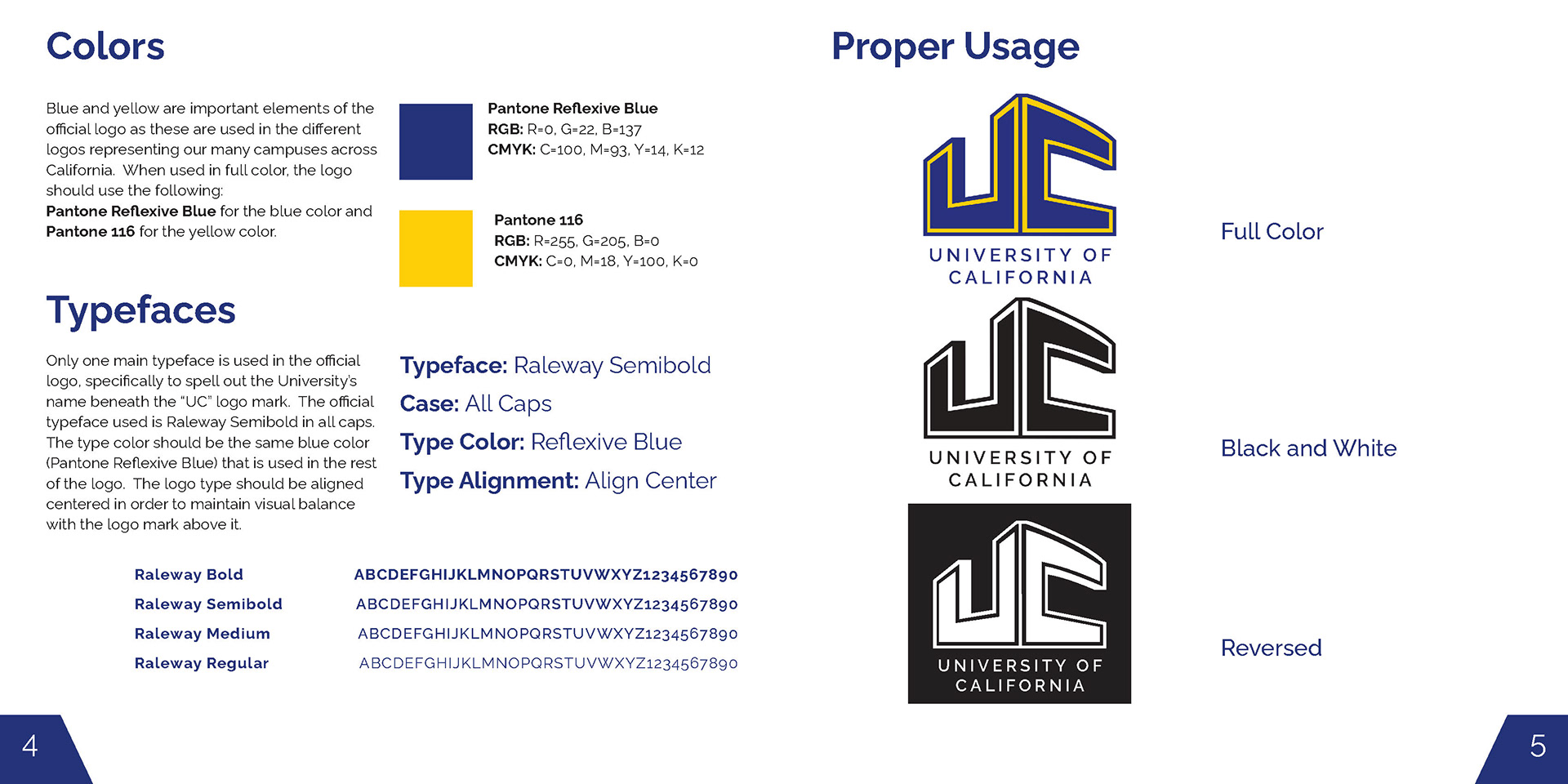
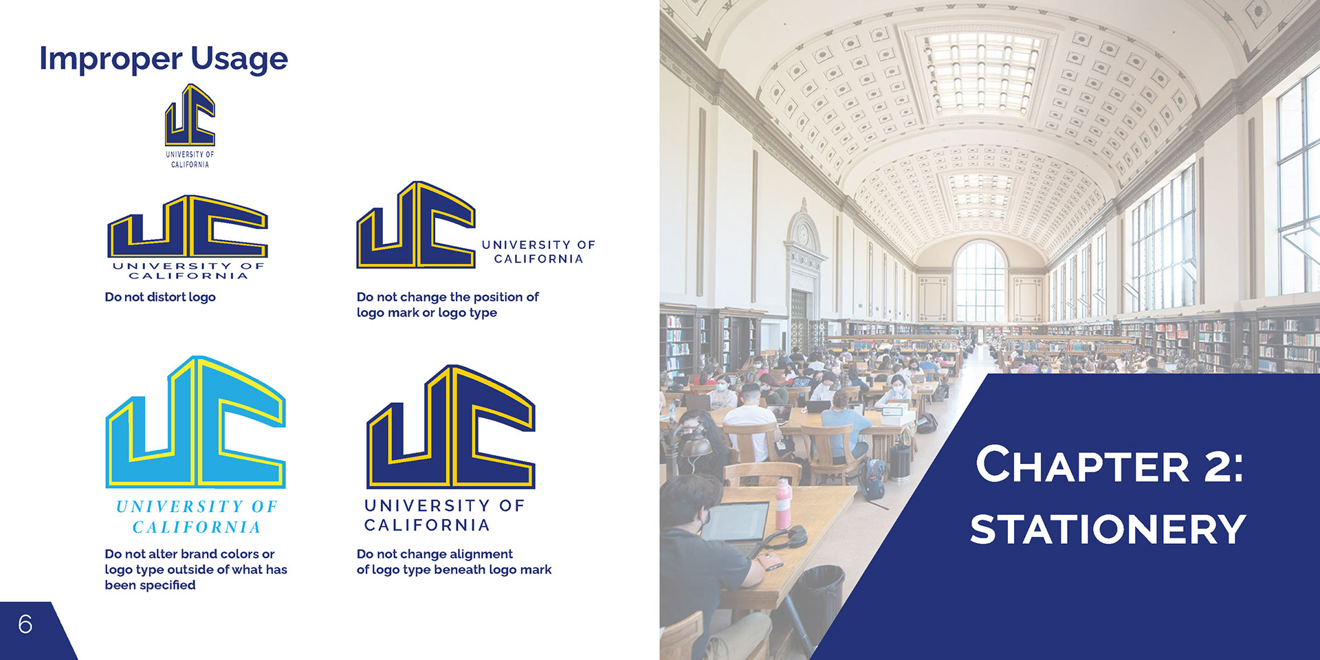
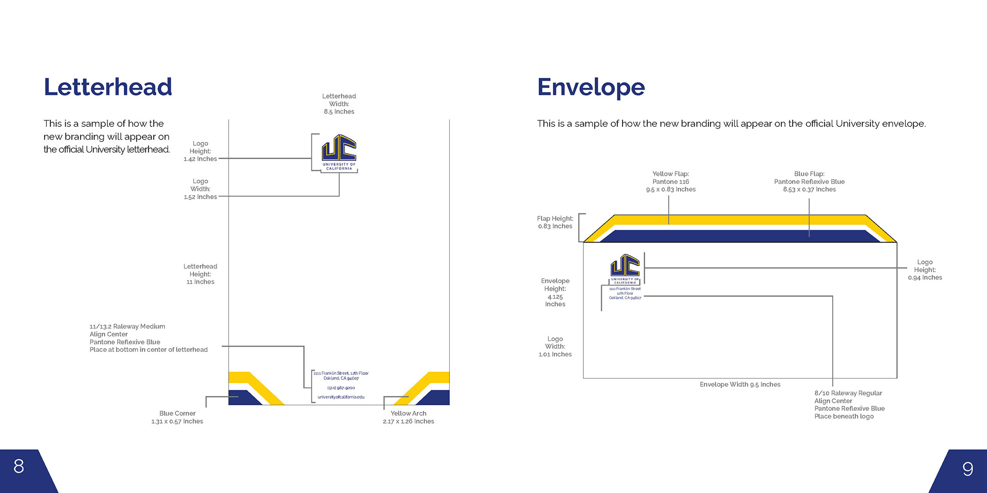
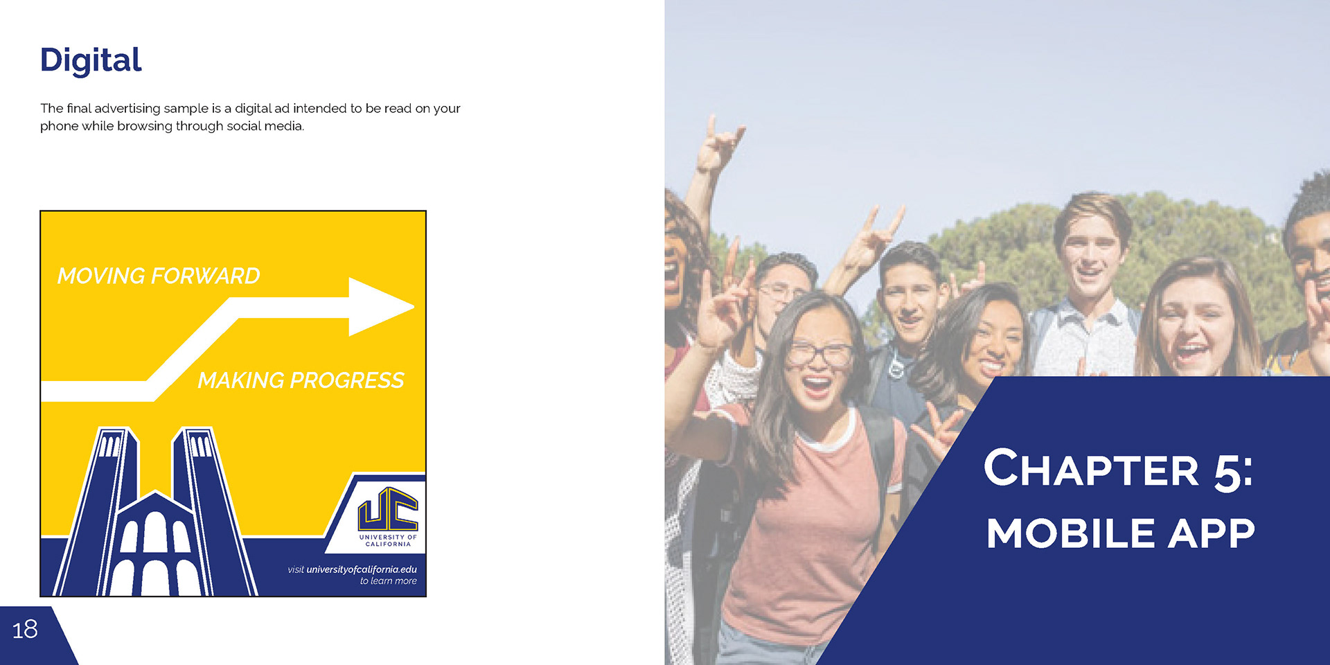
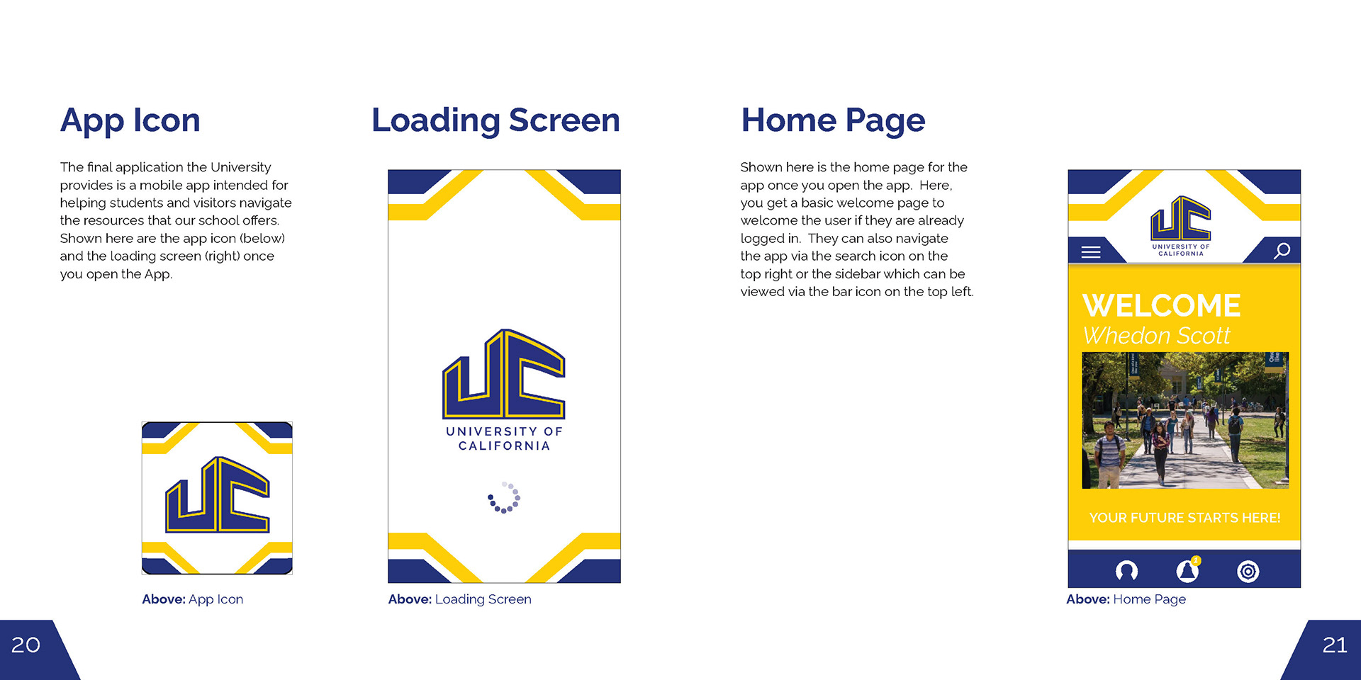
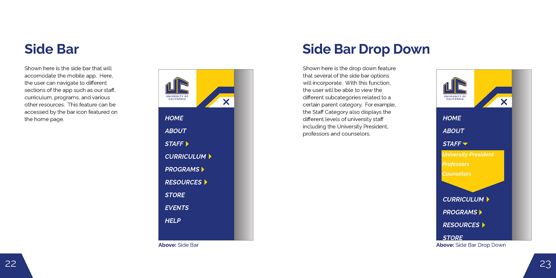
This is the Identity Guidelines Manual created to catalog all of the work I had done for my Corporate Branding class at George Mason University (Fall 2022). For the entire semester, we were instructed to take an existing organization, corporation, or charity, and completely redesign their entire brand identity. This included redesigning the official logo, stationery, merchandise, advertising, etc.
My project focused on the rebranding of the University of California college system in California. As I had family who graduated from their Irvine campus, I felt more of a personal connection with this corporation than with other possible alternatives. Also, I felt that the university's existing logo and branding did a great disservice to the progressive, forward-thinking nature that the school wanted to present itself as. I go into more detail in the Identity Guidelines Manual posted below, along with how I changed the school's branding across its different deliverables.
Front Cover
Spread #1
Spread #2
Spread #3
Spread #4
Spread #5
Spread #6
Spread #7
Spread #8
Spread #9
Spread #10
Spread #11
Spread #12
Back Cover
Book Cover Series (Spring 2022)
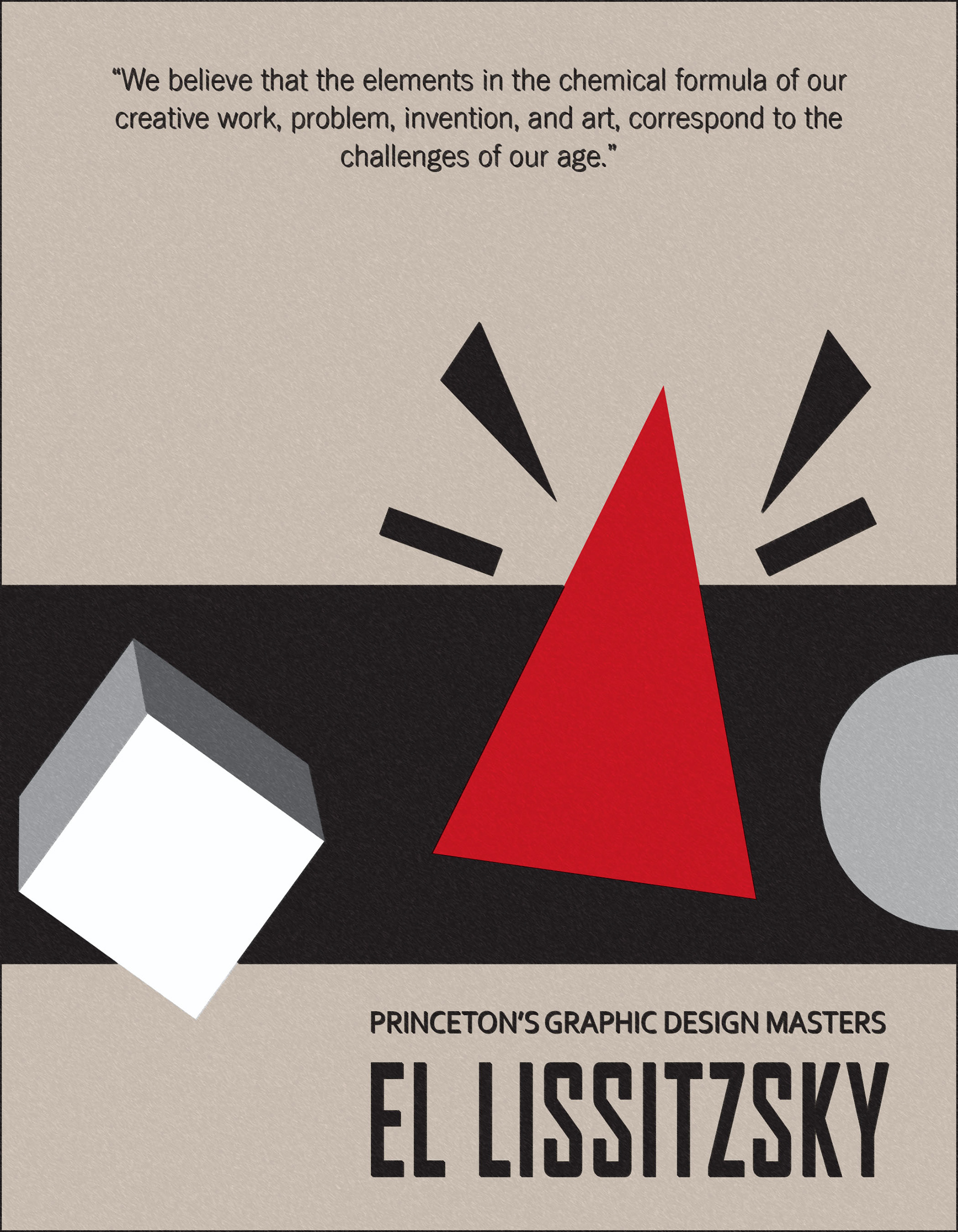
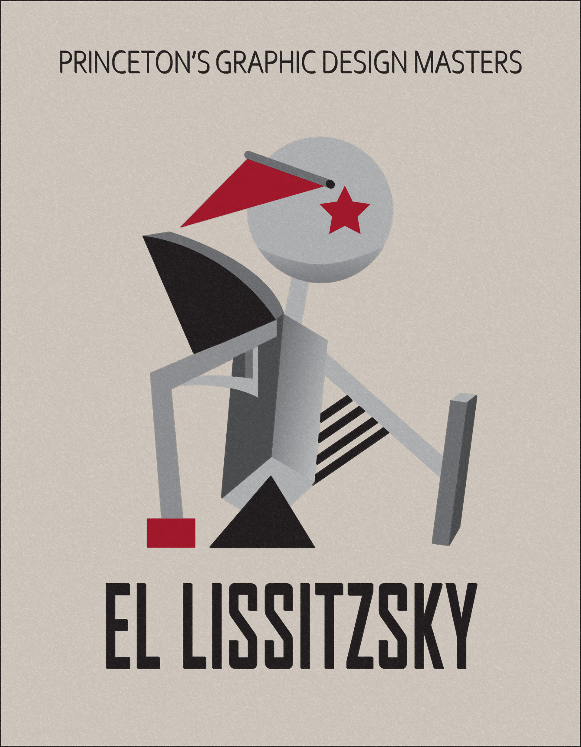
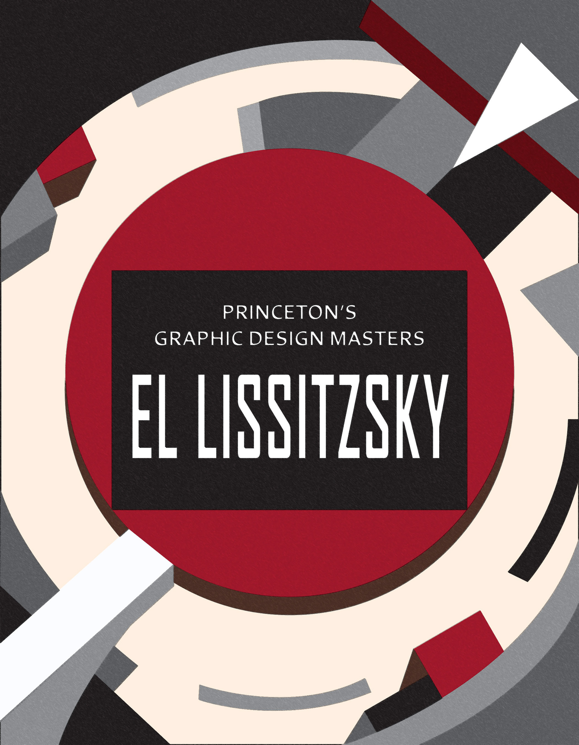
This was my second project created for my Graphic Design Principles class at George Mason University (AVT 311). Here, we were asked to create a series of three mock book covers for the "Princeton's Graphic Design Masters" series of books. For the cover design, we were tasked with researching famous graphic designers from history whose style we would then try to emulate for each cover. We were given the option of either designing each book cover to reflect a different designer or focusing on a single designer's style for the entire series. Also, at least one of the covers needed to include a quote from the designer that we chose to represent our project.
My book covers are designed to emulate the style of the late Russian graphic designer El Lissitzky (1890-1941). Lissitzsky's work was greatly influenced by the Suprematism art style pioneered by fellow designer Kazimir Malevich which sought to create "a world of non-objectivity" through the use of geometric shapes. Lissitzky was also inspired by architecture and sought to emphasize the structural elements of the design so as to create a more futuristic aesthetic in his work. Each of the covers I designed are loosely inspired by several of Lissitzsky's existing works but were designed to be their own thing. As an example, the first cover was directly inspired off of his 1919 piece "Beat the Whites with the Red Wedge '' which he had made in response to the then-recent October Revolution of 1917. This cover was also the one I chose to incorporate the quote.
Cover Variant #1 (7 x 9 Inches)
Cover Variant #2 (7 x 9 Inches)
Cover Variant #3 (7 x 9 Inches)
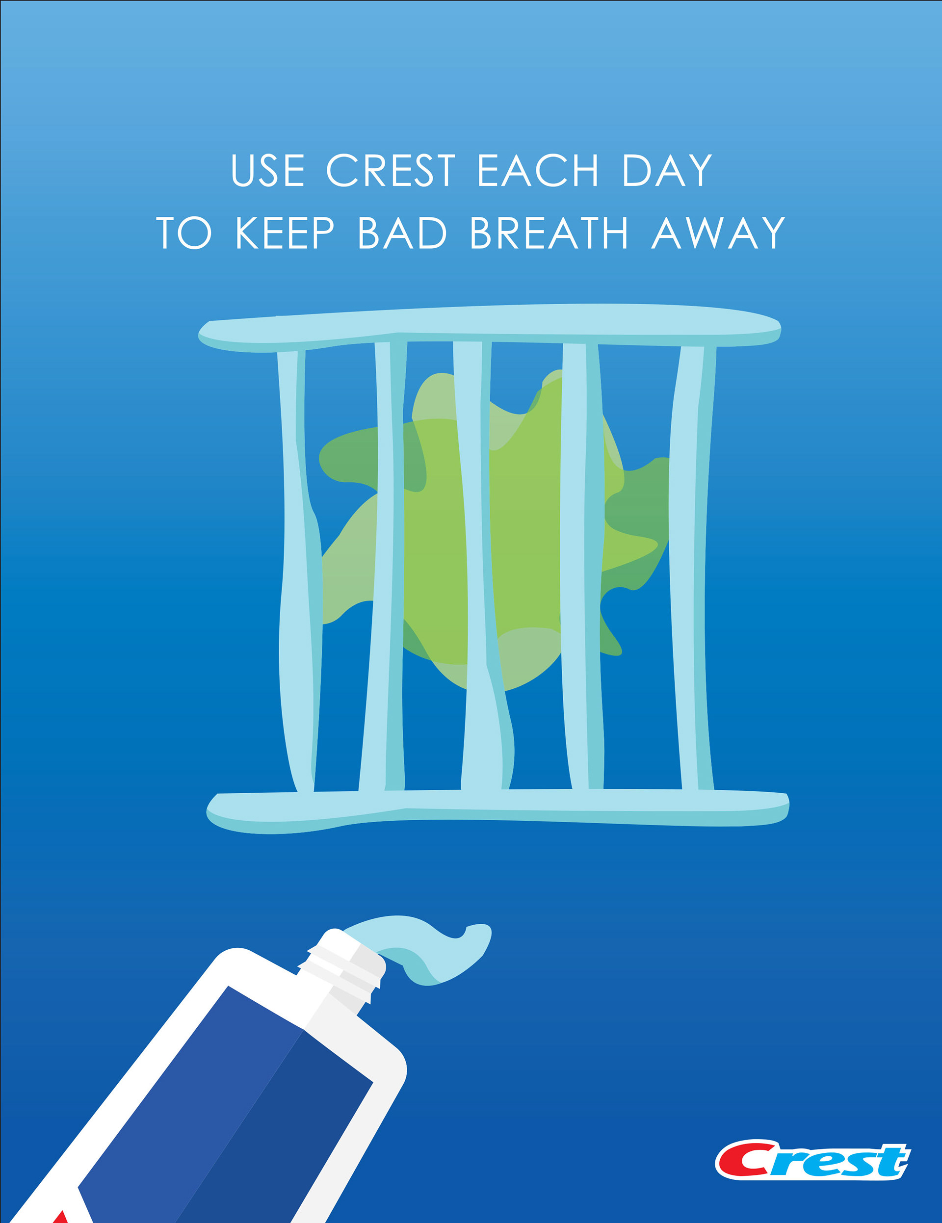
Object Ad Campaign (Spring 2022)
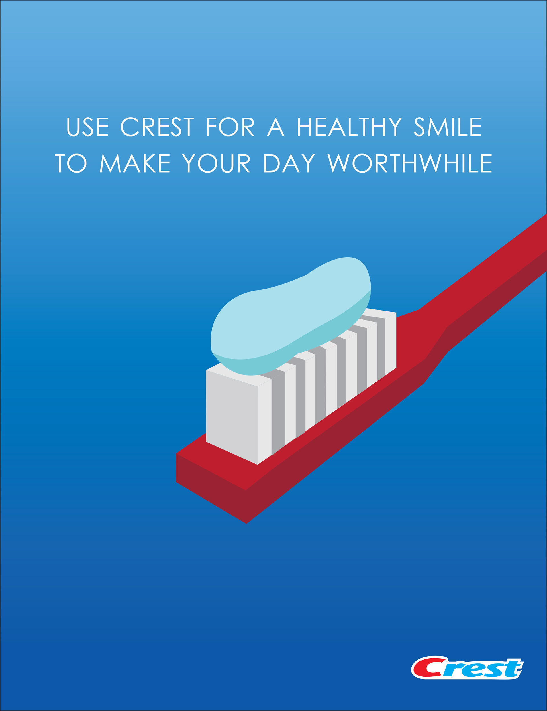
This was my first project created for my Graphic Design Principles class at George Mason University (AVT 311). For the guidelines, we were each asked to choose an object from one of five categories (home, carpenter, musical instruments, music, and fruit & vegetables), conduct research about the object, and produce a campaign of digital posters centered around them. These posters would ideally be displayed in digital/physical walk-around signage at bus stations.
For my campaign, I chose to focus on Crest toothpaste as I felt I could do more with this product than the other options offered by the professor. The first poster in this series is a simple, straightforward depiction of the product and how you use it (i.e., put it on a toothbrush to help clean your teeth). For the second and third posters, I created several joke illustrations to visually imply the toothpaste’s primary role in helping to improve your oral health. Each poster is 8.375 x 10.875 inches in size.
Advert #1 (8.375 x 10.875 inches)
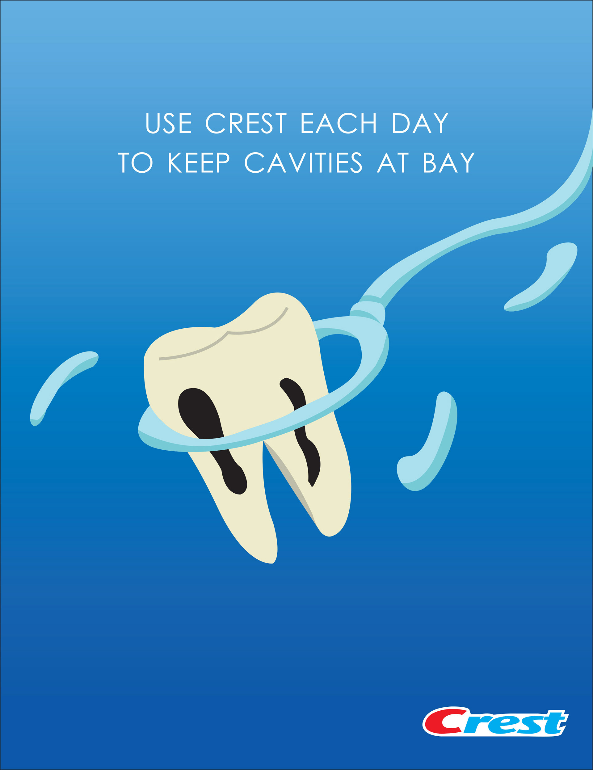
Advert #2 (8.375 x 10.875 inches)