In 2024, I took up a graphic design internship position with Trill Mag, a small digital news publication based out of the United Kingdom. I was a member of the video production and article content creation teams, where I was assigned to create illustrations and thumbnail images to accompany the various articles and videos that the magazine published on both its main website and other media channels (i.e. Instagram, TikTok, Youtube, etc.).
Article Illustrations/Cover Images
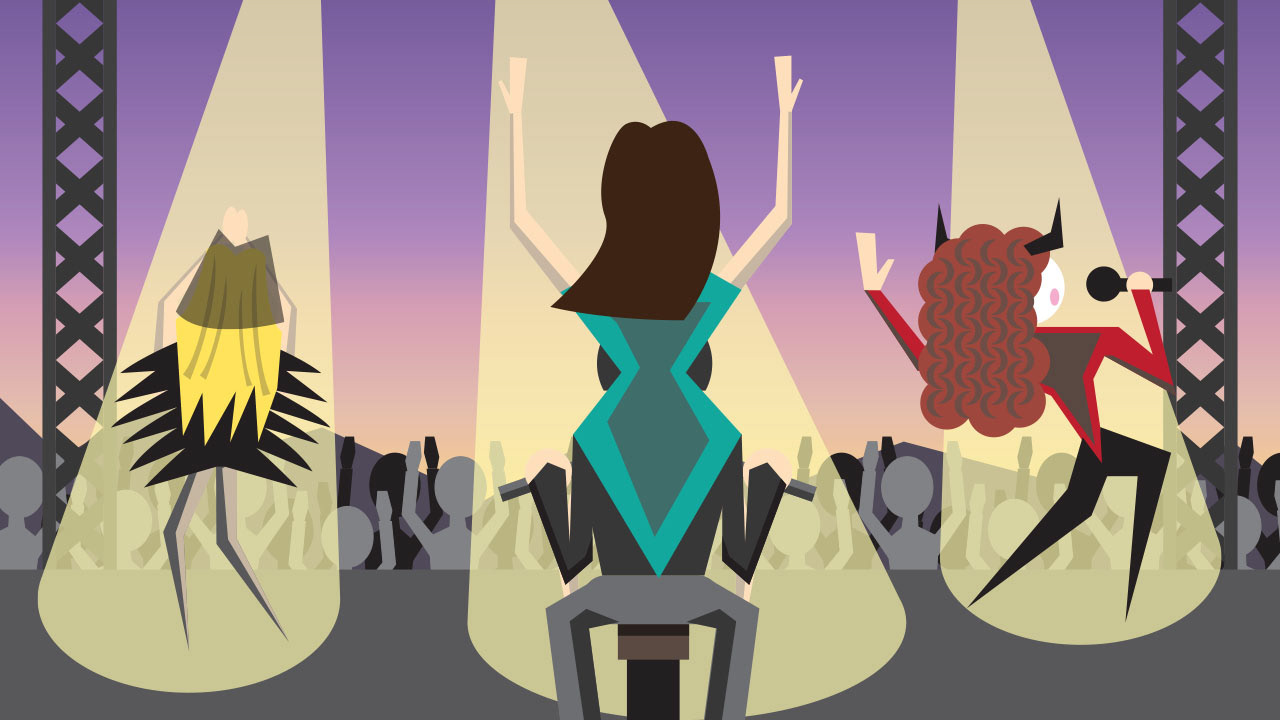
Coachella 2024 Brings Popstar Culture Back
I created this illustration for an article on Coachella 2024 and the return of "popstar culture" that it brought with it. For the composition, I wanted to create a stage setting during the event that would highlight several of the singers that are briefly discussed in the article, along with quirks they have been associated with as part of their career. From left to right, the singers featured are Sabrina Carpenter dressed in her black outfit from her controversial music video "Feather", Lana Del Ray riding on the back of a motorcycle jockey (a common element to her act), and Chappell Roan with her elaborate makeup (or "campy drag aesthetic" as described in the article).
Original Article: https://www.trillmag.com/culture/coachella-2024-brings-popstar-culture-back/
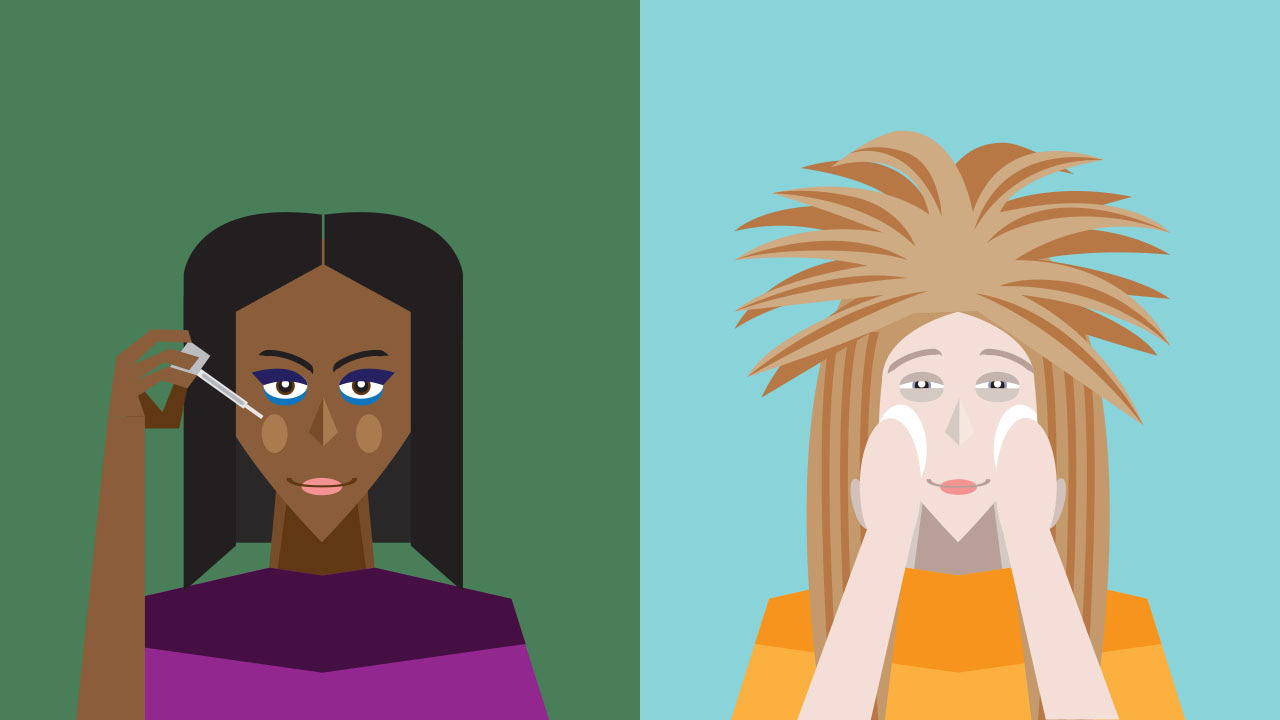
8 Of The Best Spring 2024 Beauty Trends
I created this illustration for an article on beauty trends for the 2024 spring season. For the composition, I tried to incorporate all of the main beauty trends that the article discussed into a single image (ex: 80s big hair, colorful makeup, etc.). Originally, I had wanted to incorporate all of these trends onto a single person, but I instead decided to split the different trends amongst two different people to make it easier.
Original Article: https://www.trillmag.com/lifestyle/beauty/8-of-the-best-spring-2024-beauty-trends/
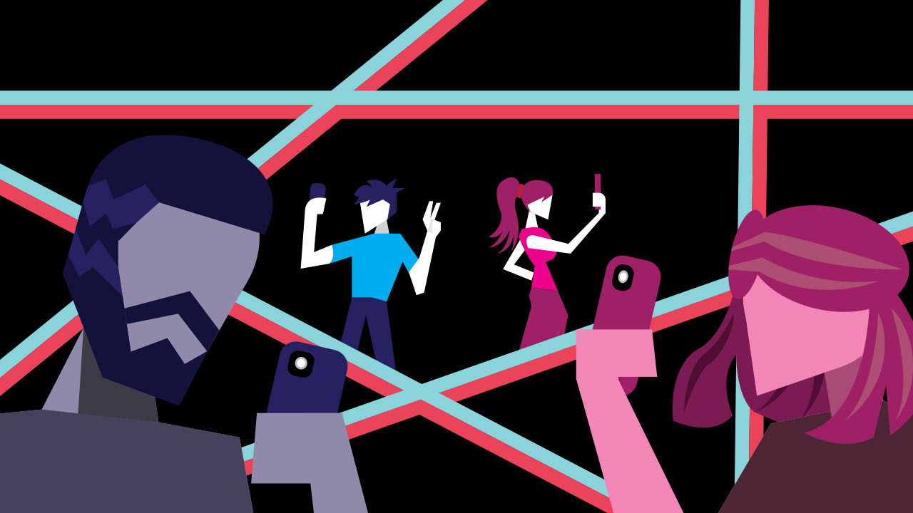
The ‘90s Babies Look Younger’ Trend: A War Between Millennials And Gen Z
This illustration was made to accompany an article about how the '90s Babies Look Younger' trend found on social media. For the layout, I used a black background overlaid with the outline of a star so as to highlight the fleeting fame these people try to find on social media. The star and background are colored in black, pink and blue, a subtle reference to the social media platform TikTok. As for the figures, I wanted to highlight the reality that many of these 30-year old social media users refuse to accept (i.e. that they aren't as young as they once were). The foreground features a man and woman (in both blue and purple/pink respectively) while the background shows the ideal younger selves they see themselves as.
Original Article: https://www.trillmag.com/culture/the-90s-babies-look-younger-trend-war-between-millennials-and-gen-z/
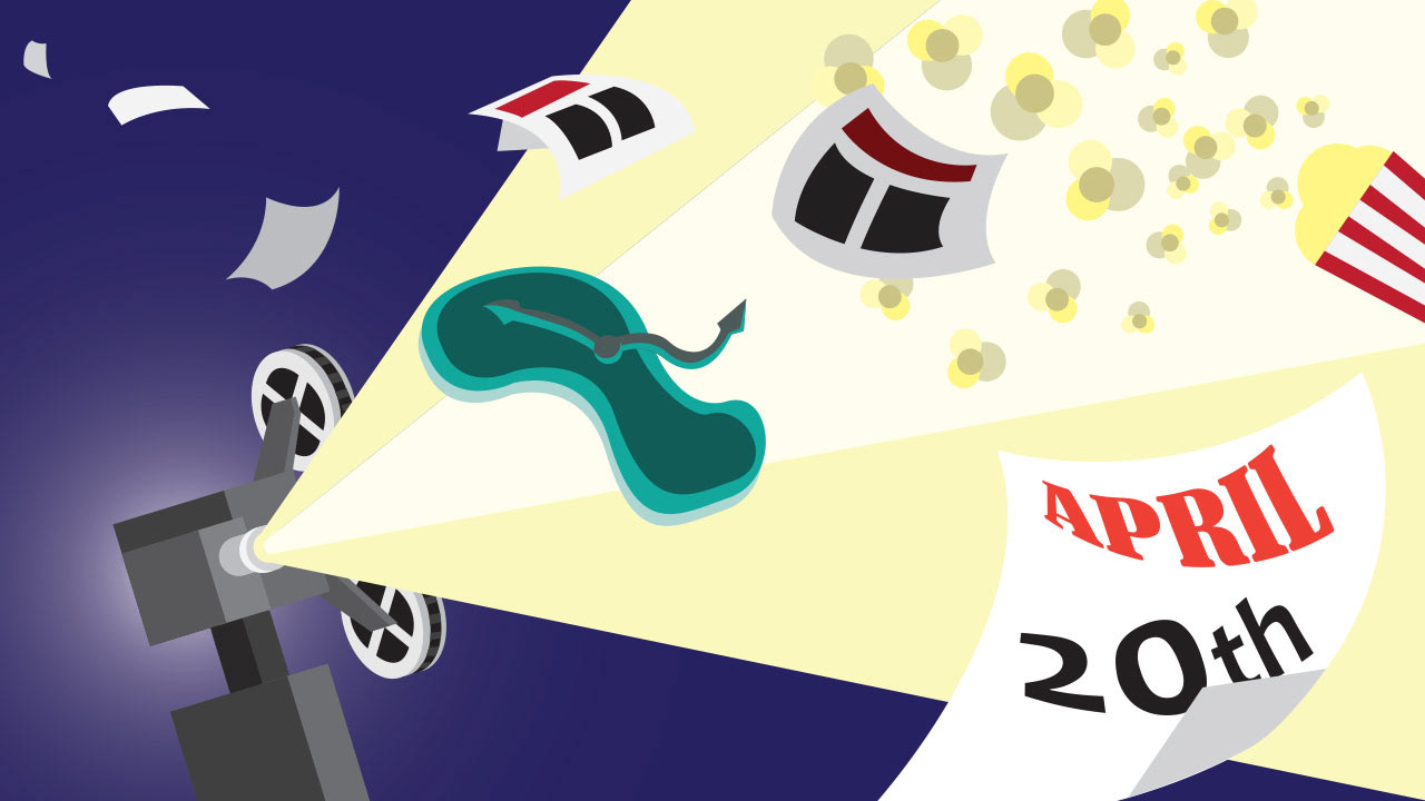
6 Surreal Movies to Watch this 4/20
I made this illustration to accompany an article listing surreal movies that would be perfect to watch on April 20th (abbreviated as 4/20 in article title). For the composition, I opted to make a more generic, surreal background that utilized different film aspects (i.e. the popcorn and projector), along with a calendar that represented April 20th. The warped green clock is a reference to Salvador Dali's surrealist masterpiece Persistence of Memory.
Original Article: https://www.trillmag.com/entertainment/tv-film/6-surreal-movies-to-watch-this-4-20/
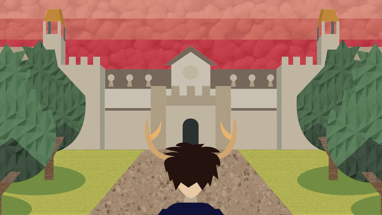
The Real Saltburn? Oxford Students Are Saltburnt Out
This illustration was made to accompany an article reviewing the movie Saltburn. I based the main composition of the image off of a brief landscape scene featured in the film (i.e. when the main character arrives at the titular Saltburn location where the film is set). I then lowered the perspective of the scene to make it look like the reader was peering right behind the main character's head as he looks onto the university building that makes up the titular location. Since this movie is supposed to be more of a psychological thriller, I decided to give the sky shades of red in order to make it look more menacing. I also added texture effects to the sky, grass, pathway, trees, and buildings so as to give the composition more depth and surrealist feeling.
Original Article: https://www.trillmag.com/entertainment/tv-film/the-real-saltburn-oxford-students-are-saltburnt-out/
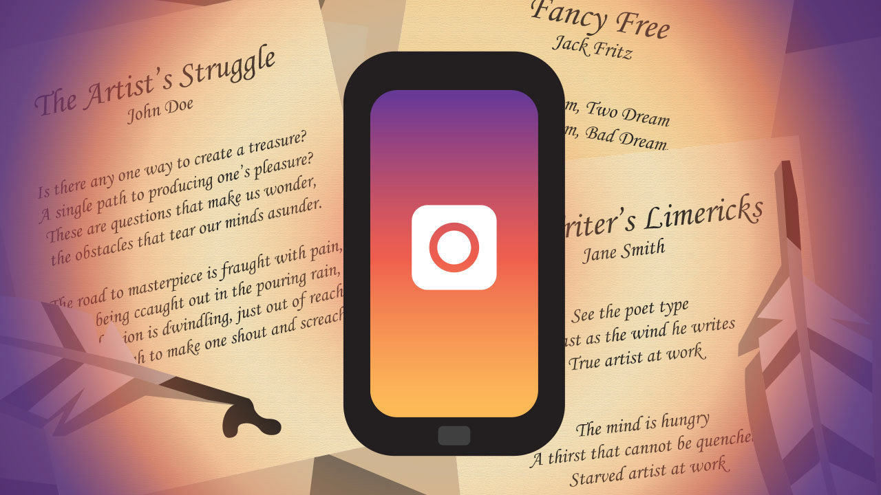
Should We Recognize Insta Poetry During National Poetry Month?
This illustration was made to accompany an article on National Poetry Month, specifically regarding whether the trend of 'Insta Poetry' (i.e. poetry published on Instagram) should be recognized as actual poetry. I wanted to have this composition highlight the technological divide between the old and new ways of creating poetry. For the background, I made up several rushed poems which I then placed onto rectangular shapes which I then scattered across the screen like pieces of paper. I also added in some quill pens so as to make it look like these were actually handwritten. I then added a phone in the foreground with a colored gradient screen and simple camera logo so that I could replicate the Instagram logo. I also added a gradient to help visually highlight the divide between handwritten work and digital works (appropriately also in the Instagram colors).
Original Article: https://www.trillmag.com/culture/insta-poetry-national-poetry-month/
Why is Dating in College *So* Difficult?
I made this illustration for an article about the difficulties of dating in college. The article originally had a stock illustration of a generic heart pattern, but the editors were looking for something that more directly related to the article. For the composition, I decided to showcase two college students, one male (blue) and one female (red/pink), looking anxiously at one another with a pair of question marks in between them to tie everything into the main message of the article. I also colored the question marks and gave them hearts to further highlight this.
Original Article: https://www.trillmag.com/life/college/the-difficulty-of-dating-in-college/

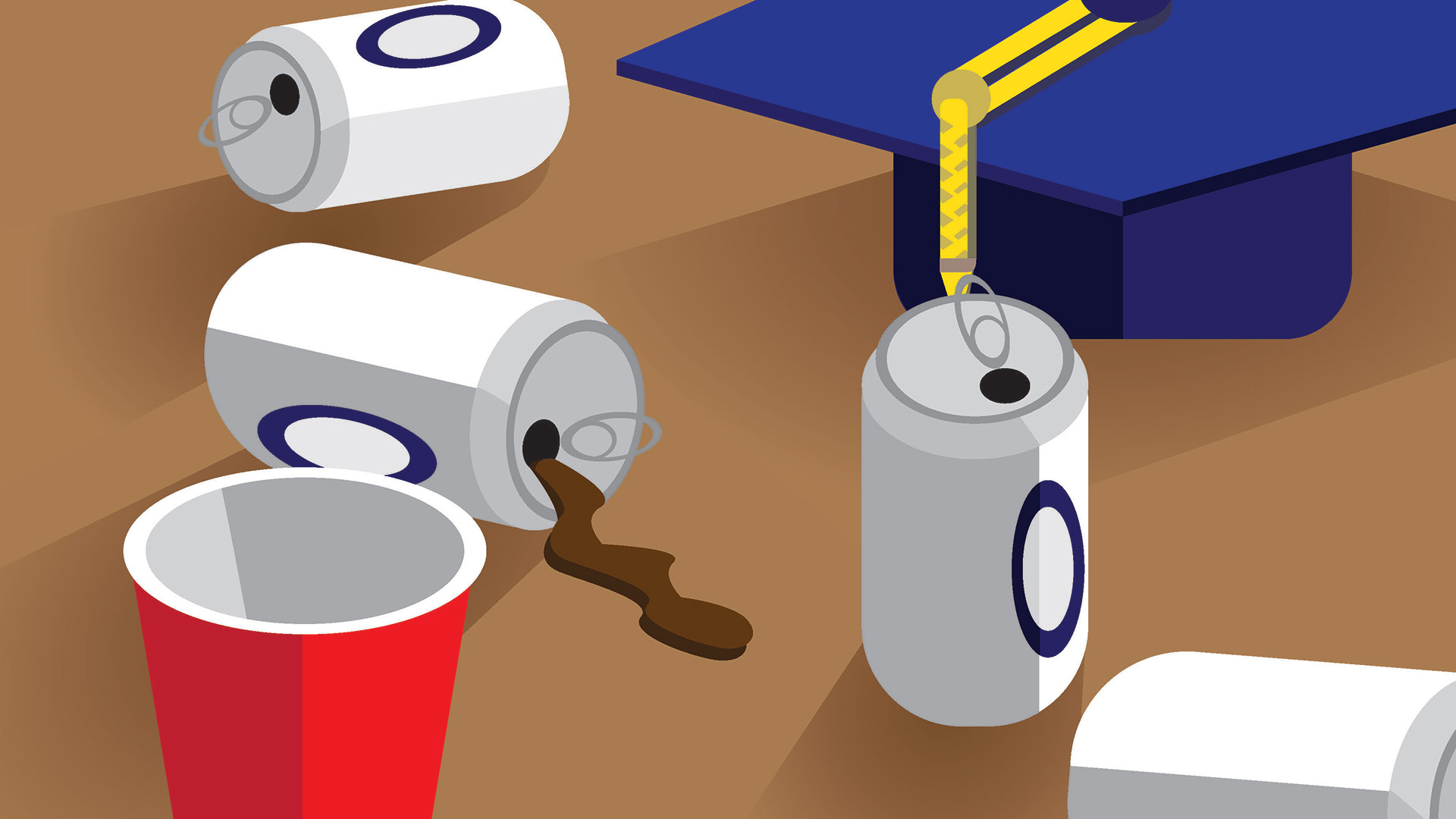
Beyond The Buzz: How To Find A Healthy Drinking Balance In College
This was the first illustration I completed as part of the internship. As a warmup, we were instructed by our supervising editor to choose an existing article on the website and design a new editorial illustration to accompany it. For my illustration, I choose an article that dealt with how to control your drinking habits while in college. For the composition, I chose to depict a tabletop scene with assorted beer cans and a red solo cup to visually imply what bad drinking habits can look like, I also included the graduation cap in the back to make it obvious that the article was specifically focused on college-aged drinkers.
Original Article: https://www.trillmag.com/life/college/beyond-the-buzz-healthy-drinking-in-college/
Video Thumbnails